

If you are looking at this page without frames, there is more information about medieval writing to be found by going to the home page (framed) or the site map (no frames).
| Scripts and Hands (5) | ||
| Given the diversity of legal hands across Europe, I guess it is a little enigmatic that Italian notaries of the 15th century, beautiful writers all, contributed to the development of a book hand with a very strong prototype, humanistic minuscule. The very clear definition of this script has been preserved forever by its use in typeface, first in typefaces made from metal stamps for each letter, and even today in electronically generated computer fonts. Typeface enthusiasts may argue over coffee on the relative virtues of Garamond over Bookman, but it's all rock'n roll to me. We can read it. It has simple rules and we understand them. | ||
 |
A grab from Gianozzi Manetti De Dignitate et Excellentia Hominis, written by Ciriago at Florence in 1454 (British Library, Harley ms 2593, f.25). | |
 |
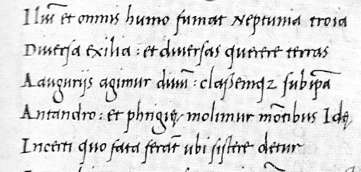
Segment from a copy of Virgil written c.1500 (British Library, add. ms. 11355, f.118v). | |
| The above examples of humanistic minuscule and humanistic italic are not only easy to read, they are easy to recognise by type. | ||
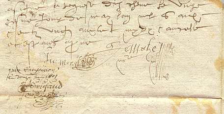
| While typeface killed the development of book scripts, handwriting continued to be used for legal and business documents for centuries. There were changes to script forms and to the names given to them. But we have to stop somewhere. Suffice to say that during the 16th and 17th centuries, some legal handwriting became quite horrible. I do not know why. Writing was a much more widely practised skill, but perhaps without the finest exemplars there in the form of elegant manuscript books, the art of elegant writing may just not have been so highly regarded. It was always there for really special calligraphic works, but it seems that every little document was not necessarily worth the trouble. | ||
 |
The tail end of a legal document of 1601, on paper, from a private collection. | |
| That is just to show you what I mean. The invention of the steel nibbed pen in the 19th century gave calligraphic writing a boost, as it allowed to writer to perform all sorts of flourishes that were beyond the capacity of the quill pen. | ||
| Trying to put all of that together, the relationship between named scripts and the hands of individual scribes is a variable process, depending on time and circumstance. Certain scripts have become strong prototypes, and this may be related to the purposes for which they were being used, as well as the nature of the education of scribes. Script styles have social purposes and can be signifiers of many things. Throughout the period under study here, writing became more and more widespread through the population and more and more relied upon. Written communications occurred through an increasing array of channels, encouraging mixing and mingling of styles. So there are forces for diversity and forces for conformity constantly in action, resulying in periodic appearances of strong prototypes, followed by diversity again. The underlying message is do not take script names too literally. They might tell you about time and circumstance and the elemental aspects of letter forms, but they may not tell you exactly what it looks like. | ||
| |
||
| |
||
|
|
||
|
If you are looking at this page without frames, there is more information about medieval writing to be found by going to the home page (framed) or the site map (no frames). |
||