


If you are looking at this page without frames, there is more information about medieval writing to be found by going to the home page (framed) or the site map (no frames).
| Scripts and Hands (4) | |||||
| By the 13th century, the English and French chanceries were using a distinctive Gothic script for their most formal kinds of charters. Formal private charters also used it. It resembled Gothic textura book hand, except that ascenders were tall and curly, and it was very formal and precise. As far as I am aware, nobody has ever assigned it a specific name, except for a broad signifier like Gothic charter hand. | |||||
 |
|||||
| This is the full text of a private charter of the 13th century (British Library, add. charter 20592). By permission of the British Library. | |||||
| However, a great deal was happening in the world of writing at this time. Chanceries were not just producing formal charters, but a range of grades of document, and they were keeping records. For the multiple purposes for which they were employed, a range of cursive scripts came into being. In the English chancery and exchequer, various departments gradually developed little particularities of style to distinguish themselves. The script known as cursiva anglicana covers a diversity of styles and degrees of formality, and was eventually used for formal documents as well. Earlier writers about the public records (eg. Johnson and Jenkinson 1915) refer to set hands and free hands. The set hands were those formalised scripts that were deemed appropriate for certain purposes, while the free hands were the individualised hands that were just tossed off for less formal purposes. Chancery clerks could do both. | |||||
 |
|||||
 |
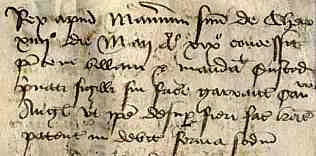
Above is the left hand end of a long narrow petition in French to Henry VI from the abbot and convent of Notre Dame de Combe in Warwickshire. It dates from 1441. At left is the endorsement of the clerk of the council on the verso of the document (London, National Archives E28/G8/18). By permission of the National Archives. | ||||
| Petitions to the chancery court had to be written out by the clerks in the correct script and language. The upper example above shows a set hand for this purpose of the time. The endorsement indicating the action to be taken is written in a free cursive; same time, same place, just looks different. | |||||
| More and more people were writing in the later middle ages; lawyers, scriveners, notaries, sheriffs, business men, educated private individuals. The scripts that they used were all still based on the old Caroline minuscule model of letters, but came in a huge range of styles, with occasional variant letters. And the styles tended to change fairly rapidly over time. It is almost impossible to designate strong script models. Scripts are fairly loosely defined. This is the area where it may be difficult to find an exemplar that looks exactly like the document that you are trying to decode. There are very few scripts and very many hands. The terminology used by paleographers of documents may be fairly loose and may describe geography, time and function rather than appearance, eg. a typical German notarial cursive of the 15th century, or suchlike. To decode your document, look at a range of scripts of appropriate time and place, and then dissect your own document for yourself. Make your own alphabet. If what you want to do is read it, it doesn't matter what the script is called. | |||||
| There are regional or even national characteristics for cursive document hands, but they represent tendencies rather than bounded categories. French hands tend to look tall and slopy, with calligraphic curly bits towards the end of the 15th century. English hands tend to loopy, becoming more angular with it as time goes on, with a very distinctive form of r that extends below the line. Italian hands tend to be rounded, neat and beautiful. German hands tend to be more blocky and Gothic in style. These characteristics are not definitive, and letter forms and styles got swapped and borrowed all over the place. | |||||
| By the time that paleographers are using the term bastarda in script names, you know that you are not going to get uniformity. Hybrid scripts take varying numbers of elements from their parental lineages and they do not all come out the same. The English term bastarda anglicana or the French term Bâtarde can imply anything from an elegant and calligraphic hand to an abominable catscratch. The terms tell you where the scripts have come from, not exactly what they look like. | |||||
| Getting back to books, Gothic textura became a strong prototype for liturgical works. With all the logic of Caroline minuscule and a capacity for compaction, it was ideal for highly legible works that were required to be transcribed accurately, were in many cases very long, and needed to look handsome and imposing. The archetype lasted for several centuries; even longer if you include Gothic print typefaces. It is intriguing that paleographers have subjected Gothic book hands to the most intricate analysis and typology (See Brown 1990, Derolez 2003) when to most of us, the differences between the varieties of Gothic textura seem very subtle indeed. There are regional and chronological differences which may help to solve all sorts of academic questions, but for those who just want to read a text, any old Gothic textura exemplar will give you the general idea. | |||||
 |
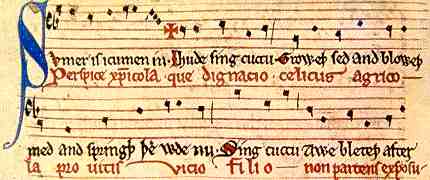
This is a segment from a song, with music, in both English and Latin, from the mid 13th century (British Libarary, Harley 978, f.118). | ||||
 |
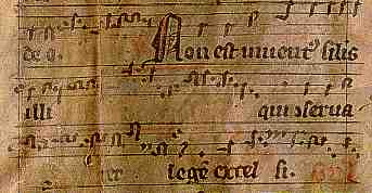
A fragment of German Gothic with musical notation, maybe 13th century, from a private collection. | ||||
 |
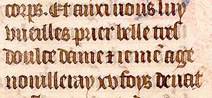
Segment from a French book of hours, 15th century, from a private collection. | ||||
 |
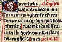
Segment from a Dutch book of hours, 15th century, from a private collection. | ||||
| You get the picture. Over centuries, various countries, different languages, the basic forms of Gothic textura are pretty standardised. Yes, there are variations in how the little feet are drawn on the bottoms of the letters. There are differences in sizes of scripts, from those of giant antiphoners to miniature Bibles. There are differences in roundness or angularity, in width of letters. There are differences in the amount of care and attention that is given to the precision and regularity of the writing. But the letters are all formed similarly and arranged and connected in similar ways; one well defined script, many hands. And the engine for all this is that old force for conformity, the church. Even when monks were no longer writing out the majority of books, which were bought from commercial stationers, the customers knew exactly what they wanted, and they got it. Paleographers of yore often used the expression "a fine liturgical hand", which could be used to describe a script that was rounded or angular, but was essentially big and bold and legible by candlelight. | |||||
| But a greater variety of books was being produced, and for a range of readers. Prestigious volumes of illuminated romances for filthy rich aristocrats were painstakingly produced in Gothic textura, but the cursive scripts of the professional writers of law and government were pillaged for more modest works. The results, in terms of script, are at least as variable as the cursive scripts of documents. Chancery scripts, legal scripts, notarial scripts all provided prototypes for cursive book hands. This raises an interesting question about how the scribes of books learned to write. Were they formally educated along with the notaries and clerks in what was called, in England, the court hand? Or did they simply copy these official styles, adding their own flourishes. There does not seem to be a great deal of information about the precise means by which various secular scribes learned their specific writing skills. | |||||
 |
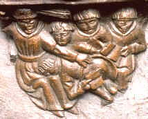
A school scene carved on a misericord in Bostom parish church, Lincolnshire. | ||||
| We know that schoolboys in the monastic schools and grammar schools were taught to read and write Latin, often employing violent means of teaching that are no longer found in the educational establishments of our time. We don't know whether it was here that they learned the stylistic traits that categorised professional writers, or whether that was learned in apprenticeships later in their lives. | |||||
| In England, the influence of the chancery style on the general writing of documents and books suggests that there must have been some commonality of teaching, not only of basic written literacy, but of the elements of style. | |||||
 |
Little grab from a 15th century English breviary, from a private collection. | ||||
| The above example shows the chancery style even infiltrating a liturgical book, although it is a small format book, presumably for the use of an individual priest, rather than a display volume meriting the full Gothic textura treatment. | |||||
| Jane Roberts, in her very comprehensive book on scripts used for writings in the English language (Roberts 2005), gives a clear exposition of the difference between anglicana, or cursive book hand derived from English precursors, and Secretary, derived from French precursors, based primarily on the shapes of certain key letters. But she says herself, "Often it is hard to decide between an Anglicana or a Secretary definition". Some anglicana scripts borrowed certain letter forms from Secretary and vice versa. If the detailed analysis that she applies to the script examples illustrated in her book were applied to comparisons of cursive scripts from other parts of western Europe, I am sure we would come up with similar conclusions. There are script models, but their boundaries have become very fluid, and there are many, many different hands. | |||||
| As with documents, you have to decide what you are doing. Are you performing an analysis of writing style, or are you trying to read a text? If the latter, then it is not of earthshattering importance what the script is called and giving it a name will not necessarily help you to read it. You just have to pull it apart and see how it works. | |||||
| |
|||||
| |
|||||
|
|
|||||
|
If you are looking at this page without frames, there is more information about medieval writing to be found by going to the home page (framed) or the site map (no frames). |
|||||