

If you are looking at this page without frames, there is more information about medieval writing to be found by going to the home page (framed) or the site map (no frames).
| The Strange History of Humanistic Minuscule (4) | |||||
 |
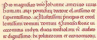
This segment represents part of the scribe's colophon to a copy of 1451 of the Politics and Economics of Aristotle, translated into Latin by Leonardo Aretino for Cosimo de Medici, from a private collection. (From New Palaeographical Society 1907) | ||||
| The example above shows the dilemma. We can call it a humanistic display script for want of anything better, as it has some features of Gothic rotunda and other features of the revived Caroline minuscule. For example, it has both the upright d and the backsloping d. It has the simplified Gothic r after o, as well as the standard r, which can also appear after o. It has the final short and curly s. Letter combinations such as do touch each other, but it is not so much biting of bows, as some paleographers call this phenomenon, as a gentle kissing of bows. But it looks more like Caroline minuscule than Gothic. Now this is starting to get a bit intuitive and unscientific, but we can note that the words are neatly spaced out and the lines well separated with fairly tall ascenders to the letters. And it is a celebration of beautiful writing. Let's face it, if someone was going to honour you as sapientissimo, illustrissimi and excellentissimi, as the scribe has done in this rubric colophon, you would want them to do it in beautiful writing. | |||||
| There is a script sample and paleography exercise for this example. | |||||
 |
|||||
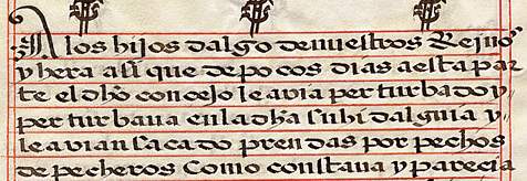
| Segment from a Spanish legal document, possibly late 15th or 16th century, from a private collection. | |||||
| Although these display scripts are generally found as book hands, there are, as always, some exceptions where they have been used in documents. The above example is evidently from a carta ejecutoria, a form a royal letters patent from late medieval Spain and very formal. Many of these documents were bestowing aristocratic status on individuals, a bit of an industry in medieval Spain, and they became exceedingly elaborate in later centuries. This one appears to be some sort of reading of the riot act after a civil disturbance, and they had a few of them in late medieval Spain. It is in the Spanish language. I think this looks more rotunda than humanistic, but who knows? | |||||
| Notarial hands were also influenced by these stylistic changes, and some of them are very elegant. The term humanistic cursive is used, but are they any more humanistic than the cursive scripts that went before? Given the input of notarial cursives into the development of the humanistic range of scripts, this seems to be running around in circles definitionally. | |||||
 |
|||||
| This is a random segment of a large Italian notarial document of 1500, concerned with a court case over the payment of a very substantial debt. From a private collection. | |||||
| The above example is exceptionally neat and legible, and although there are a few evolving letter forms, such as the r that looks like z and the lopsided v, it has that clear, orderly layout of words. Somehow this document always brings up a mental image of a somewhat elderly notary with his inkpots and quills neatly arranged in straight lines on his desk. I know, excessive imagination running wild. | |||||
| There is a script sample for this document, but no paleography exercise yet as the thing is so big that I am not sure how to deal with it. | |||||
| On the other hand, the following example of an italic style of notarial hand from 1549 is utterly revolting. It seems that even in Italy handwriting turned to porridge in the 16th century. | |||||
 |
|||||
| The beginning of an Italian notarial document of 1549 involving the certification of a death, from a private collection. | |||||
| Printed books began to appear in the late 15th century, and they changed the way that we think about words and letters. In a manuscript, the scribe may have attempted to make each letter conform to a model, but each time a letter is written it is, in many subtle ways, unique. The same scribe may write noticeably differently, depending on whether he is alert or sleepy, working in a leisurely manner or rushing, making huge efforts toward perfection or scribbling something informally. In a printed typeface, the same letter looks identical every time it appears. (Have you ever tried to explain this to an IT geek with a fixation on Unicode fonts?) Differences between typefaces become clarified and harder edged. Spaces between letters and words are mechanically controlled. Letters look the same wherever they occur in a word. | |||||
| Various scripts were used as the bases for early typefaces, including Gothic of the textura and rotunda variety, French bâtarde, humanistic minuscule and italic. The eventual division of typefaces into Gothic Black Letter, as used in Germany into the 20th century, and Roman, as used in Italy, France, England and places generally to the west and south in Europe, takes the most distinctive features of Gothic textura and humanistic minuscule and produces two categories which cannot be confused, unlike their handwriting predecessors. | |||||
 |
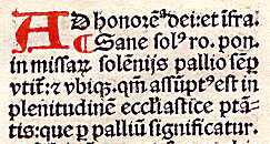
Segment from a printed page from the Decretals of Gregory IX, printed in 1505 in Paris, from a private collection. | ||||
| The typeface for this printed page is based on Gothic rotunda/humanistic display script. The rubric letters have been added by hand. | |||||
 |
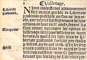
Segment from a printed page of a work on the statutes of England, printed in London in 1559, from a private collection. | ||||
| This work uses Gothic textura as the basis for the typeface. | |||||
 |
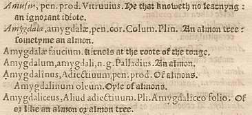
Segment of a page from a Latin dictionary Thesaurus Linguae, by Thomas Cooper, printed in London in 1584, from a private collection. | ||||
| By this stage different typefaces are being employed in the same work for clarity of reading; Italic for the first occurrence of a Latin word, Roman for the following derived words in Latin and some notes, Black Letter Gothic for the English translation. The Roman and Gothic typefaces are quite different in appearance. They have become two very recognisable categories, no longer showing their long history of interaction and gradations of form. | |||||
| Apologies for an in joke, but if you want to know what is funny about the juxtapostion of the words for "He that knoweth no learning: an ignorant idiote" and an almond tree, you will have to go to the blog and read the article on Of Tennis Balls and Mulberry Trees. | |||||
| But the story is not quite over yet. | |||||
|
|
|||||
|
If you are looking at this page without frames, there is more information about medieval writing to be found by going to the home page (framed) or the site map (no frames). |
|||||