If you are looking at this page without frames, there is more information about medieval writing to be found by going to the home page (framed) or the site map (no frames).
| The Strange History of Humanistic Minuscule (3) | |||
| The series of scripts referred to as humanistic is credited to a group of scribes and scholars of the late 14th and early 15th centuries. By this stage in history, we start to know the names of certain influential individuals; Collucio Salutati, Poggio Bracciolini, Niccolo Niccoli. This is not because there were more individuals around in the 15th century, or that individualism had a more prominent place, but because proximity in time to us means that their individualities have not become lost along with their original manuscripts, as with the scholars of earlier days. Because these individuals and their immediate predecessors were participants in an intellectual movement which we now call Humanism, the script that they wrote in somehow got labelled as humanistic minuscule; but it did not stay in its particular philosophical box, it eventually took over the western European written, and later printed, world. There are a few funny anomalies in relation to the idea of the development of this script, or rather script family, as like most handwriting styles, there were many variants and hybrids for different purposes. | |||
| Another intellectual box that we like to use to classify things is the term Renaissance. These scholars were trying to reclaim the cultural heritage of ancient Rome. This can be seen as part of the ever continuing rivalry between Italy, especially the hierarchy of the church, and the German empires. It seems odd then that they took as a model for their renovated script, something old from that very German empire; the script we now call Caroline minuscule. It could be said that this was the script in which they were most likely to have read some of their ancient Classical works, as it was Carolingian scholarship which rescued many texts from destruction by copying works ferreted away in obscure monasteries. However, they did not directly copy the original style as found in the library of Charlemagne and his monasteries, but a later version. Bischoff (Bischoff 1990) relates it to scripts of around the 10th or 11th centuries. Brown (Brown 1990) suggests late 12th century models. So much for precision in paleographical dating. | |||
|
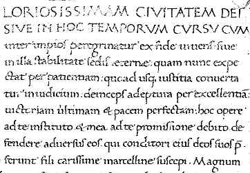
This is a segment from a late 15th century copy of De Civitate Dei of St Augustine, produced in Italy, probably in Naples (British Library, add. ms. 15246, f.29). (From New Palaeographical Society 1911) | ||
| There is a script sample and paleography exercise for this example. | |||
| It can be very beautiful; rounded and even, words nicely spaced, straight and tall. But were these scholarly folk chronologically and ethnically confused, or was there another agenda in adopting this writing style? Perhaps it goes back to the whole idea of a written text and the process of reading. | |||
| Scholars now place the origins of the concept of humanistic minuscule further back in the 14th century, with the scholar and scribe Petrarch. (See Bischoff 1990, Petrucci 1995) He did not invent, or re-invent, a new script as such. In his many known autograph manuscripts, he wrote in various styles, including chancery hand, business scripts and forms of Italian Gothic book hand. What he did contribute was a change in the idea of reading and writing that led to different methods of forming the writing. While Italian Gothic rotunda may not have looked exceptionally Gothic, it shared the characteristic with the northern style that texts were heavily abbreviated so that great chunks of text could be absorbed rather than allowing the reader to cruise in a leisurely manner along the lines of words in order to abstract and understand the meaning. Scholarly texts were heavily glossed, which prescribed to the reader how the texts were to be interpreted. Absorb, remember, assimilate, but do not explore and interpret too much. The new scripts owed much to the work of the notaries, not just because notaries could do aesthetically pleasing writing, but because they had to write in such a manner that each text could be individually read and understood. The writer was directly addressing the reader, not simply noting down predigested concepts for them to ingest. The choice of letter forms was only part of the story. | |||
| The advantage of the old Caroline minuscule for this mode of reading was its one to one relationship beween letters and their written form, the lack of ligatures, the sparing use of abbreviation, the clear rounded forms of letters and the clear and logical spacing of words along a line. If you have found a good thing, stick to it. But we never do. We keep experimenting. | |||
| The notarial contribution to the script included a more free flowing, if not exactly cursive, mode of writing, which has come to be known as humanistic italic. | |||
|
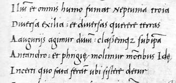
Segment from a copy of Virgil written c.1500 (British Library, add. ms. 11355, f.118v). | ||
| Just to spoil the logic and symmetry of this tale, certain ligatures were introduced to the script, namely st and ct, as well as the old et ligature which has lasted until the present time, even jumping linguistic boundaries, to becomes the ampersand &, representing et or and. I have even got one of those on my keyboard. The st and ct ligatures did not come from the old Caroline minuscule book hand, but had been in use in very formal documents such as papal diplomas, sometimes in highly exaggerated form. Strange to tell, you will find these ligatures in very expensively produced printed books of the 19th and early 20th centuries. | |||
|
|||
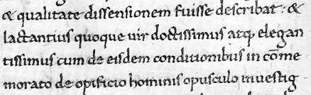
| A grab from Gianozzi Manetti De Dignitate et Excellentia Hominis, written by Ciriago at Florence in 1454 (British Library, Harley ms 2593, f.25). | |||
| The above example shows two et ligatures at the beginning and end of the top line, two ct ligatures in the second line and an st ligature in the last word of the last line. | |||
| So the scripts of 15th century Italy, while based on a formal and elegant prototype, diversified as a result of the peculiarities of individual style, adoption and adaptation, and the hybridisation of old and new, just like any other family of scripts. Liturgical works tended toward the conservative style, and continued to be produced in scripts that were pretty much Gothic rotunda. | |||
|
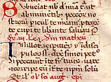
Segment from an Italian breviary of c.1475, from north Italy, from a private collection. | ||
| Breviaries being the immense condensed works that they were, this is a tiny, simplified form of Gothic rotunda/humanistic minuscule which possibly has most in common with the littera bononiensis of the universities. It is most likely appearing very enlarged on your screen. | |||
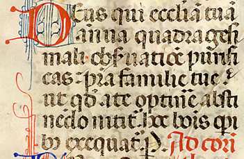
| Grab from a missal of c.1460, probably from Siena, from a private collection. | |
||
| The bolder and grander script of a missal is produced in a style which is decidedly Gothic, even including the Gothic forms of d, r and s, and some conjoined letters, although it has the rounder forms and wider spacing of rotunda. There are multiple abbreviations. | |||
| Some hybrids between Gothic rotunda and humanistic minuscule have been designated with the name humanistic display script, but it is hard to work out exactly where the lines are drawn within the continuum of styles. | |||
|
|
|||
|
If you are looking at this page without frames, there is more information about medieval writing to be found by going to the home page (framed) or the site map (no frames). |
|||