

If you are looking at this page without frames, there is more information about medieval writing to be found by going to the home page (framed) or the site map (no frames).
| The Strange History of Humanistic Minuscule (5) | |||
| Manuscript books and printed books coexisted for some time. Printed works ensured standardisation of content, and books became cheaper, despite the slow and labour intensive process of printing at that time. However, some prestigious works, especially those where owners wanted to choose some of their own content, were produced well into the 16th century. | |||
 |
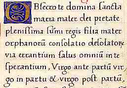
Segment of a page from a book of hours of the early 16th century, from a private collection. | ||
| While we would call this script a humanistic minuscule, it is not the flowing hand of a notarial scribe, but a painstakingly mechanical script which owes much to the boxy and rigid forms of typeface; Roman typeface escapes back into the wilds of handwriting. | |||
| There is a script sample and paleography exercise for this example. | |||
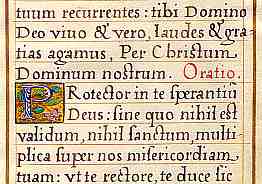
| Leaf from a book of hours dated 1570, from a private collection. |  |
||
| This one is very similar in handwriting style. By this very late date, the mere fact of it being a handwritten item suggests that it is from a very prestigious production for an individual. The gold illuminated initial P is quite exquisite. | |||
| So here it is enlarged, just to prove it. Unfortunately, it is very hard to get the gold to show on a digital image. The background is actually a bright glowing gold. | |||
| There has always been some sense that certain styles of writing were appropriate for particular purposes. Over many centuries, there have probably been scribes who could produce different styles for different jobs. One might assume, for example, that the same scribes associated with the court of Charlemagne could produce the mannered Merovingian chancery script for writing royal diplomas, while learning the new reformed Caroline minuscule for transcribing Bibles and psalters. Or perhaps not; maybe they were specialists. The influence of Italian notarial style on humanistic book hands is mirrored in England by the development of new cursive book hands almost identical to the cursiva anglicana and bastarda hands employed by the chancery. Writing style is following the learned skills of professional writers and scribes. It is interesting that it is after the appearance of printing that there appear writing masters' books in which they display their ability to write in different styles for specific purposes. | |||
 |
Model alphabet from a German scribe's display book of 1538. (From Steffens 1929) | ||
| As printing caused the standardisation of letter forms, there was perhaps an added significance to the style of scripts in handwritten productions, based on mental templates of the correctness of the appearance of the writing for the particular job in hand. | |||
| The story of humanistic minuscule represents the end of the history of book hand. For centuries books have been produced with essentially the same sets of letters by mechanical reproduction. It is only now with computer fonts that new and fascinating ways of producing text are available, although I have not seen anything too wild and wacky in academic book production as yet. Handwriting remained in use for documents, letters, legal recording, accounts and all manner of useful little jobs and continued to evolve. Apart from professional calligraphers producing fancy certificates and the like, this largely involved cursive writing. | |||
| Humanistic minuscule sometimes receives rather short shrift in paleography books, probably because it is made up of letter forms that are very familiar to us, so it is not difficult for us to read. It is a reinvented script. We have seen it before. The history of its initial invention as Caroline minuscule, its alteration and diversification into various forms of Gothic, and its return in new guise is not merely a history of changing letter forms. It is a history of reading, and of attitudes of readers to text. It made its initial appearance in order to make reading, learning and transcription more accurate, because it is a very accurately rendered script. It reappeared in a much more literate age as a method of leisurely, contemplative reading with proper understanding when Gothic script had become something of a set of prompt notes for texts absorbed, remembered, assimilated but not explored too much or over analysed. (Thomas Aquinas et al notwithstanding.) It is ideally suited to Latin, as Latin is a phonetic language where each letter has a unique sound, so it is a little intriguing that it is so ubiquitous in English printed text, when English is not phonetic or logical or consistent. Perhaps we are learning to read in different ways yet again. | |||
|
|
|||
|
If you are looking at this page without frames, there is more information about medieval writing to be found by going to the home page (framed) or the site map (no frames). |
|||