If you are looking at this page without frames, there is more information about medieval writing to be found by going to the home page (framed) or the site map (no frames).
| The History of Gothic Book Hands (2) | ||||||
| By the 13th century, formal Gothic book hand had acquired all the characteristics which made it distinctive and caused it to be dubbed textura, or textualis, in reference to a perceived resemblance to a woven textile. | ||||||
|
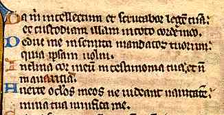
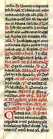
Segment from a page of a 13th century psalter or breviary, probably Flemish, from a private collection. | |||||
| The example at left is from a compact volume, of medium quality, and probably very much a working rather than display text. | ||||||
| Letters were angular and made of repeating strokes with many diagonal elements. Letters all had little angular feet. Ascenders and descenders tended to be relatively short, presumably allowing more lines to be fitted on to a page. Letters which bent in opposite directons tended to become conjoined, so that combinations such as de or do were squashed into one unit, becoming conceptually like those ligatures which had been removed in the Carolingian writing reforms. Changes in letter form from the preceding Caroline minuscule included a short diagonal ascender on d instead of the vertical form, a double chambered a in which the curl at the top was extended to become a closed loop, the addition of the short curly form of s when found at the end of a word, and a simplified form of r which occurred mainly after the letter o. There is no longer a simple one to one relationship between form and individual alphabet letters. | ||||||
| At its best it was both elegant and legible, but when written more hastily, it could become disjointed and difficult to resolve. Furthermore, so much more was being written. A unifying good idea diversified into a whole range of script types, grades and degrees of elegance, depending on the purpose to which it was being put. The first issue was to deal with the ever increasing quantity of material which was put in a single volume, and the second was the need to make these volumes portable. Bibles and liturgical service books, for example, were no longer only sitting grandly in libraries and on lecterns, but were being toted around the country by the new preaching orders like the Dominicans and Franciscans. | ||||||
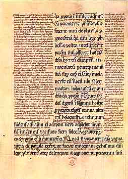
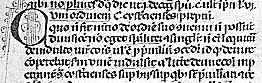
| The book of Leviticus and the gospel of St John, with commentary and glosses, written at St Mary's Abbey, Buildwas in 1176. In the British Library. | |
|||||
| The medieval process of reproducing texts involved not only copying them, but expanding and commenting on them. Bibles, as well as other works, as if they were not hefty enough already, acquired a whole set of commentary which was reproduced on the page around and through the main text. This is referred to as the gloss and became a feature of certain Bibles from the 12th century onward. Sometimes these were added casually by readers, but in the case of the Bible in particular, the text was standardised and specified. This required a very tiny modified version of Gothic textura, often highly abbreviated as well as compact and simplified. | ||||||
|
This tiny glossing script was then used in the 13th century for the main text to make Bibles more portable. I know the script at left cannot be read properly on screen, but then it is a bit of a job with the real thing. (To examine the script enlarged you will need to examine the paleography exercise on this website.) Suffice to say that the letter forms are essentially similar to the larger script, but the feet are simplified, and there is a great deal of abbreviation. The reading of such a script must have been something of an art in its own right, and must have involved a great deal of committing important passages to memory. Nevertheless, these works contain frequent corrections, sometimes in the original script and sometimes in later marginal annotations, so somebody pored through them with great diligence and precision. | |||||
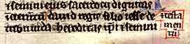
| Segment from a page of a 13th century portable Bible, and below an enlarged segment showing a scribal correction on the same page, from a private collection. | ||||||
|
||||||
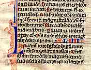
| There was a developing tendency from the 13th century onward to put more and more into writing and commit less to memory. The ill named breviary, for example, put into a single text everything that made up the round of the divine office for a whole year, including Psalms, canticles, versicles, antiphons, responses, readings, musical notation and the rubric which explained all these bits. The term breviary derives from the fact that in earlier times, the parts of the office that the participants might reasonably be expected to remember for themselves, such as the Psalms and canticles, were indicated only by a couple of words at the beginning, so it was an abbreviation of the office. Eventually it became the complete text, but the named remained. Breviaries were frequently not giant lectern books, but compact volumes, presumably for the private use of individual priests and monks, so the size of the script may be very tiny indeed, and the use of abbreviation so enthusiastic that they are virtually incomprehensible except to those thoroughly versed in the mysteries of the text. | |
|||||
| Column from a late 14th century breviary from southern France, for Augustinian hermits, from a private collection. | ||||||
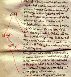
| The 13th century also saw the beginnings of the universities, and the demands of these on scholars, students and scribes put some pressure on the Gothic script, designed as it had been for leisurely elegance rather than rapid transcription. Once again, simplified letter forms, crammed lines of writing and a great deal of abbreviation characterised the products of the universities. | ||||||
|
An example of littera bononiensis from a 14th century work of Johannis Andreae Novella on the Decretals (Vatic 1456, v.f.179). (From Ehrle and Libaert 1932) | |||||
| The particular style of writing employed for legal works at the University of Bologna has been dubbed littera bononiensis, which just means letters from Bologna, so that doesn't actually tell you very much. It displays the characteristics of very small size, simplified letter forms and heavy abbreviation, but in the rather more rounded form of Gothic used in Italy, known as rotunda, which is another part of the story we will get to shortly. The example above is actually a fairly neat and tidy version of the script, because paleography books have a habit of showing the nicest example of each type that they can find. Add in the factors of books hastily transcribed by dictation in lectures, then corrected and annotated, and you probably have a text that is legible only to someone already thoroughly versed in the subject under discussion, and possibly only by the person who wrote it in the first place. (Hmmm, that sounds a bit like some of my old university notes. Maybe not so much changes.) | ||||||
| The example at right is a text for study, written in a tiny, fractured, simplified and abbreviated version of Italian Gothic rotunda, with strange little scribbled diagrams in the margins pointing to sections of the text. I might do a paleography exercise on this one day, if I can ever get the faintest idea of what it is all about. The point is, Gothic can make a very fine and excellent display script for carefully written books, but for the increasing volume of hasty and crammed writing that was appearing from the 13th century on, it did tend to fall to pieces. There had to be a better way. | |
|||||
| Segment from an early 14th century page of a work ascribed, probably incorrectly, to Albertus Magnus on the Virgin Mary, from a private collection. | ||||||
| Meanwhile, the more formal branches of the Gothic family continued to develop and diversify. | ||||||
|
|
||||||
|
If you are looking at this page without frames, there is more information about medieval writing to be found by going to the home page (framed) or the site map (no frames). |
||||||