

If you are looking at this page without frames, there is more information about medieval writing to be found by going to the home page (framed) or the site map (no frames).
| The History of Gothic Book Hands | |||||
| The form of writing known as Gothic book hand, and more specifically Gothic textura or textualis, is probably what most people think of when they think of medieval handwriting. It is not a single style or type, but a whole evolving family of scripts which survived until the days of the printing press, and beyond in some countries. The general forms of the script can be found in any book on paleography or calligraphy, but its development and diversification is part of the whole history of increasing literacy in the later middle ages. | |||||
| |
The early development of Gothic book hand was not a revolutionary process. The letter forms are essentially those of the preceding Caroline minuscule, as shown in the example at left, and would have been quite legible to readers and writers of that script. The development of Caroline minuscule from the range of diverse scripts that preceded it was revolutionary, and enabled writings from all over western Europe to be mutually comprehensible. The change to Gothic was more subtle. | ||||
| This sample of text comes from the early 11th century Harley Psalter (British Library, Harley 603), by permission of the British Library. | |||||
| The production of scripts with a somewhat more angular appearance and angular tops and tails to the letters began in northern France and the Low Countries in the 11th century, and spread rapidly around the Latin literate world during the 12th century. There is not one particular point at which Caroline minuscule becomes Gothic. The example at right might be called a rather angular and blocky Caroline minuscule, or a protogothic. It retains the clear letter by letter legibility of the Caroline script. | |
||||
| This example is from a 12th century French copy of De Vita Caesarum by Gaius Suetonius Tranquillus (British Library, Egerton 3055, f.2), by permission of the British Library. | |||||
| So what drove this change? The conventional answer is that the Gothic style, being laterally compressed, allowed more text to be squeezed onto a page, conserving the valuable resource of parchment. It took a lot of sheep, goats or calves to produce a hefty book. Nevertheless, some books of this era, even massive volumes like Bibles, were produced in large and bold lettering. Why not simply write smaller? | |||||
|
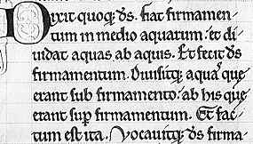
Segment from a late 12th century Bible in three volumes, text from the first page of Genesis (Paris, Bibliothèque St Geneviève, MS 8-10) (From New Palaeographical Society 1907) | ||||
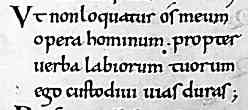
| In the 12th century, literacy was still very much concentrated in the church, although this century represented the beginning of a great and accelerating expansion of lay literacy and literacy in legal process. It was also a period when the church was undertaking one of its periodic programs of literary housekeeping, trying to replace older versions of Biblical and liturgical texts with fully standardised versions derived exactly from the Vulgate Bible of Jerome. Large and very splendid volumes were produced as exemplars and salted around various major religious centres where they could be used to produce accurate copies of the text. The writing had to be clear and legible for accurate transciption. (See De Hamel 2001) | |||||
| Boldly written works began to be produced using extensive abbreviation, which not only compressed the text, but paradoxically, may have aided legibility and more rapid reading. As the letter forms became more angular, many smaller letters such as i, m, n, u and v were made up from repeating angular strokes called minims. The more laterally compact the script becomes, the harder it is to differentiate these letters. The use of the dotted i begins to appear at about this time, but often only when it is adjacent to another i or other letters created from minims. A very common form of abbreviation was to replace the letters m or n with a superscript abbreviation mark, not only saving space but reducing the muddle of minims. Hyphenation appears in order to aid legibility when words extend from one line to another. | |
||||
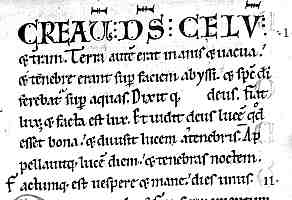
| Segment from the first page of Genesis from a two volume Bible of 1148 from Germany (British Library Harley 2803, f.6v), by permission of the British Library. | |||||
| Caroline minuscule was a script in which every letter was clearly delineated and differentiated, abandoning the elaborate ligatures of previous book hands. Writings in this script could be read slowly, phonetically and accurately, letter by letter if necessary. The use of extensive abbreviation in the new Gothic style meant that a larger vocabulary of graphic signs was required to read a text, and that the reader might be expected to extend this vocabulary of graphic signs by remembering and recognising whole words. The example above shows a number of examples of short words abbreviated in a standard form. So text is transmitted accurately but compactly, while the reader is trained to read faster. (See Parkes 1991, Parkes 2008) | |||||
| This defines the earliest Gothic handwriting as the bold and clear, accurately readable script of luxurious volumes which were prestige items, as well as important exemplars. From this great distance in time, it is mainly important and carefully curated books which survive. The lesser working service books and books for personal study were more likely to have fallen to pieces over time. However, the very rapid acceleration in the range and quantity of written material that survives from the immediately succeeding centuries suggests that there was a genuine change in how much was written down and how much was required to be remembered. Perhaps a detailed examination of those scattered bits and pieces of ancient written parchment preserved as bookbinding scraps might ferret out some of what was at the less elegant end of the scale. | |||||
|
Sample from a bookbinding fragment containing, I am told, a work by Eugippius on the works of Augustine, from the late 12th century, from a private collection. | ||||
| The example above from a study text shows small, neat lettering in a protogothic style, careful and accurate but not particularly grand, but the letters are hard to recognise because ....... | |||||
|
|||||
| ... they are back to front, as this reversed image shows. You should be able to pick out some letters now. Iron gall ink being the corrosive stuff that it is, this reversed impression has been formed when two pieces of parchment were tightly bound together in a bookbinding and the ink from one worked its way into the adjacent sheet, which just goes to show that wondrous things are to be found in odd places. | |||||
| The script of documents followed some aspects of Gothic style, especially in England and France, but had some particularities of their own. That is another story. | |||||
|
|
|||||
|
If you are looking at this page without frames, there is more information about medieval writing to be found by going to the home page (framed) or the site map (no frames). |
|||||