If you are looking at this page without frames, there is more information about medieval writing to be found by going to the home page (framed) or the site map (no frames).
| The History of Gothic Book Hands (3) | ||||
| Variants of form within the category of Gothic textura have more to do with the care and precision of execution than chronological or geographical variation. The most formal examples were painstakingly produced as prestigious items for display and status. | ||||
|
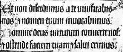
This segment is from a very famous manuscript, the Luttrell Psalter of around 1340, now in the British Library. The page shown is f.149. (From New Palaeographical Society 1904) | |||
| The slowest and most careful way of producing the script involved carefully squaring off the bases of most of the letters instead of giving them diagonal feet. This is difficult for the scribe, and was only used in rare manuscripts of great value, such as the example above, which is possibly the most ferociously precisely penned work of all time. Paleographers have named the script Gothica prescissa, or if they wanted to be more precise about it themselves, Gothica prescissa sine pedibus, which means without feet, because it doesn't have any. As the Luttrell Psalter seems to always be given as the example of this type, here is another, just to show that there are some. | ||||
|
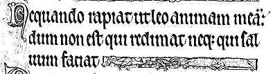
Segment from an early 13th century psalter (Cambridge.Trinity College Library, MS B. 11. 4, f.16) (From New Palaeographical Society 1911) | |||
| In the above example, over one hundred years earlier than the previous, the scribe has been allowed a little mercy in that he has put a slight diagonal kink in the bottoms of the letters, but the bases are still finished off flat. | ||||
| The more usual image that we have of Gothic textura is of a chunky script with diagonal blocky feet on the bases of letters. If the feet were produced in a neat and formal manner, the script is known as Gothica textura quadrata. Such scripts were used for important and formal display manuscripts from fine psalters of the 13th century to elegant books of hours of the 15th century. They even formed the basis of some early printing typefaces. These kinds of typefaces were replaced by the Italian style in most areas of western Europe, although Gothic typefaces remained in use in Germany into the 20th century. In its boldest form, it is sometimes referred to as Black Letter Gothic. | ||||
|
Sample from a French book of hours, probably 15th century, from a private collection. | |||
| The above example of textura quadrata is from the introduction to the prayers known as the Joys of the Virgin from a French book of hours. It is in the French language, chosen just to show that this script was not exclusively confined to Latin texts. | ||||
| When texts were written more rapidly, and with less care and precision, the blocky feet became simplified either into a curve, or a simple diagonal hairline slash. There is a whole hierarchy of terminology for these grades of script, but the terms define neither time nor place nor purpose. They simply define the speed and care of execution of the writing. They can appear in all manner of types of books. | ||||
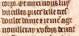
| This segment from a psalter of a plain working variety shows how untidy and uneven late Gothic textura could become when it was executed relatively rapidly. The bases of the letters are finished off with a little flick to the right. This example is at least well spaced out and easily legible. | |
|||
| Segment from a page of a late 15th or 16th century German psalter, from a private collection. | ||||
|
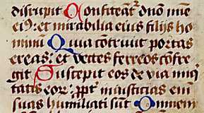
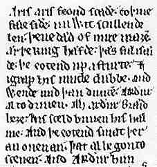
Segment from an early 13th century version of Layamon's Brut (British Library, Cotton Caligula A IX, f.155). (From The New Palaeographical Society 1906) | |||
| The example at left shows the messy, fractured appearance of Gothic textura style book hand when not written to the highest standard. The legibility in this case is not enhanced by the unfamiliar language, English. Latin of the 13th century is much easier to read than English of the same era, trust me. The letters also have a wobbly look that seems to creep in when there is a lack of quality control. | ||||
| Now I can discern a potential complaint that this is not a proper history, because we are not proceeding in correct chronological order. The point is, that at the top end of the quality scale, Gothic book hand did not really change much for three hundred years or so. At the lower end of the quality scale, there was a problem which persisted as long as people attempted to use the textura style for rapid writing. It got tiny and over abbreviated. It got fractured and wobbly. It degenerated into lines of messy minims. Meanwhile, the scribes who wrote out legal and business documents had sorted out the problem for themselves. The secret to producing writing that was beautiful and impressive, but could be churned out in ever increasing quantity, was to develop cursive scripts. The elegant cursive hands of the chanceries and law courts were raided to produce new hybridised book hands that could be written quickly and elegantly. Paleographers have labelled these new scripts with variations on the word bastard. I prefer to think of them as the legitimate offspring of the socially mobile reading and writing classes. | ||||
|
|
||||
|
If you are looking at this page without frames, there is more information about medieval writing to be found by going to the home page (framed) or the site map (no frames). |
||||