 |
|
Page
Design (2) |
|
Hierarchies
of headings with a range of sizes and letter forms, as specified by modern
word processing programs, are another legacy from the era of the manuscript
book. Small headings, sometimes in rubric,
might occupy a single column width or a full page width at the beginning
of a new section. Major divisions may be indicated by a large heading
at the top of a new page. Special scripts
could be employed to differentiate the headings. Such conventions are
very familiar to us and we don't think about them very much. However,
they are significant because they represent visual code for rendering
the text more comprehensible. Heading hierarchies became very fomalised in the Carolingian era. The fact that they have endured for hundreds
and hundreds of years indicates their success as a concept. |
 |
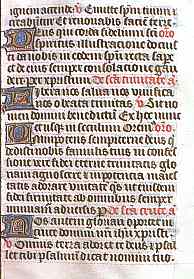
A
page from the commentary of St Jerome on Isaiah, from c.800, probably
written in the monastery of St Martin at Tours (British Library, Egerton
2831, f.48). |
|
This
page shows an enlarged heading at the end of one section, in the second
column, followed by an enlarged decorative initial and first line of the
following section. It is clearly a place marker, especially as the heading
reads
FINIT
EXPLANATIONUM IN
ISAIA LIBER XU INCIPIT
LIBER XUI |
|
That
simply means End of the Explanation of Isaiah Book
25, Beginning of Book 26, which makes it breathtakingly clear what
the function of the heading is in terms of enhancing readability. Commonly
the word explicit, rather than finit,
is in the heading indicating the end of a section, leading to the use
of the terms incipit
and explicit
by palaeographers to describe such headings. Most esoteric jargon can
ultimately be explained in simple terms. |
|
Occasionally
the beginning of a particular passage of text is considered to be so significant
that a whole page is devoted to constructing a display heading or even
initial. The normal formatting of the text goes out the window as illustrative
elements and text are combined to form patterns. The letters may be rearranged
so they no longer read in the normal way from left to right, or they form
anagrams or puzzles. Significant passages of Biblical
text were special candidates for this treatment. |
 |
 |
|
First
page of Psalm 51 in a late 10th century psalter (British Library, add
ms 37517, f.33). |
|
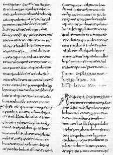
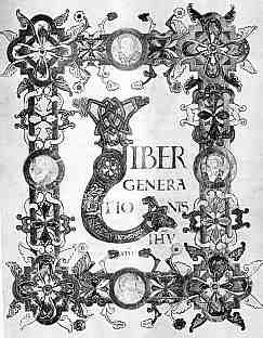
First
page of St Matthew in an early 11th century gospel book (Cambridge, Trinity
College Library, MS B.10.4). |
|
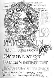
The
first reads, in somewhat entangled form QUID
GLORIARIS IN MALITIA QUI POTENS ES IN INIQUITATE TOTA
DIE INIUSTITIAM COGITAUIT LINGUA TUA SICUT NOUACULA and
continues in an uncial
script before reverting to the insular
minuscule of the main text. |
|
The
second reads LIBER
GENERATIONIS IHU (IESU) XPI (CHRISTI) amongst
an entanglement of foliate ornament, interlace, and medallions depicting
the evangelists. |
|
An
entire page has thus been appropriated for the purpose of marking an important
place in the text through the use of enlarged and unusual scripts, elaborate
decoration, but also by altering the strict and repeating left to right
horizontal rhythm of the page. Here the penman has broken away from the design
that could later be emulated by a machine. |
|
In
between these extremes of the minor heading and the heading which occupies
a whole page, enlarged initials, historiated
initials and miniatures
could be inserted to provide emphasis, to suggest points to pause and
ponder, to mark a passage in the text or to mark a place in mental space.
Elaborate borders may contain some clues for reading the text, but often
seem to simply identify a page through its graphic elements. Books designed
for boring old scholars to study in their cloisters or university rooms
might go on and on for pages of plain horizontal text. Books from which
segments were read during liturgy,
or even those designed for personal religious contemplation, may be more
liberally festooned with these graphic punctuation marks and reminders. |
|
|
A
simple text page from a book of hours divides the text up with enlarged
illuminated initials and rubrics (National Library of Australia, MS 1097/9,
f.35r). By permission of the National Library of Australia. |
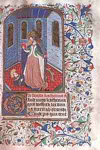 |
St
Catherine stands in triumph over her pagan oppressor in a miniature page
from the same book of hours as above (f.22r). By permission of the National
Library of Australia. |
|
This
page shows a very standard layout for the beginning of a new section in
a book of hours,
with a miniature above a small box of text, which includes an enlarged
initial and a rubric heading as well as a few lines of text. The whole
is enclosed by a lavish floral and foliate border. St Catherine is depicted
with her well known visual attributes of book, sword and broken wheel.
The page begins a section on prayers to St Catherine, so provides an obvious
visual clue to the partially literate. |
|
A
particular form of page layout was used throughout out the medieval period
for the presentation of poetry. The first letter of each line was enlarged
and set slightly to the left of its usual position. This did not break
the basic left to right horizontal mode of reading, but must have served
as some sort of little memory jogger to read in poetic mode. There is
a terrible temptation to try and discover anagrams or other code in the
vertical lines of initials, but there was no such intention on the part
of the author or scribe. |
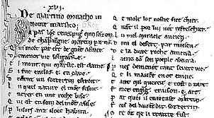 |
Section
of page of The Dialogues of Gregory the Great translated into French verse,
from c.1212-13 (Paris, Bibliothèque Nationale, MS Français
24766, f.82). |
|
While
we might wonder why the medieval scribe
did not indulge in greater flights of fancy in the arrangment of his text,
and why he mostly restrained himself to writing in horizontal lines, it
was this convention that made the newfangled printed books of the 15th
century an easy transistion to accept for the reader. They looked pretty
much like the books they were used to. There was nothing to alert the
reader to the fact that this technology would change the significance
of the written word forever. Forever? Well, for a very long time. |
|
continued |
 previous
page previous
page |
|
Decoration |
|
 |
|
|
|
|
|