If you are looking at this page without frames, there is more information about medieval writing to be found by going to the home page (framed) or the site map (no frames).
| Page Design (3) | |||
| Hypertext is supposedly an invention of the computer age, but the scribes of medieval manuscripts had their means of dealing with multiple texts, either simultaneously on one page, or through crossreferencing. There are various means, for example, of handling bilingual texts. | |||
|
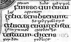
Segment from the late 7th century Lindisfarne Gospels (British Library, Cotton Nero D IV f.5), showing the 10th century interlinear English gloss. By permission of the British Library. | ||
| Latin works of the Anglo-Saxon era sometimes had a running translation inserted as an interlinear gloss. In the famous example above, this was not part of the original conception of the work, as the translation has been added several centuries after the Latin text. However, it has become part of the page design of the work as it was read and used by the monks of Northumbria. Try doing that with your industrial book production system. | |||
| There were various techniques for designing a page to accommodate English and Latin texts from the beginning. | |||
| Certain texts had commentaries in the form of glosses as part of the page design. The glosses could then be transcribed along with the main text when the book was copied, so that preparation of the page for copying involved ruling up the areas for the main text and the glosses. Careful calculation and accurate writing must have been involved in the preparation of these texts. | |||
|
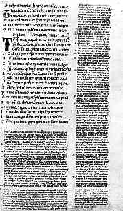
Page of a glossed 14th century copy of Virgil which belonged to Petrarch and was glossed in his own hand (Milan, Biblioteca Ambrosiana, im Ausstellungssaal, f.35). (From Steffens 1929) | ||
| This example shows a typical arrangement, with the main text in a large Gothic script, set out in the normal method for poetry with an enlarged initial set apart from the beginning of each line. The gloss is in a smaller, compact script around two sides of the main text, with an even tinier script added at the bottom of the page. It was not unusual for the gloss to be longer and denser than the main text and the page layout itself demonstrates something of the cumulative nature of literate knowledge in the middle ages, as core texts carried along an ever increasing weight of commentary. | |||
| Glossed works included Bibles, theological and philosophical works, works of literature, works of law; almost anything that could be commented on, was commented on. In the case of the Bible, the gloss was itself a standard text which was transcribed when the book was copied. Books produced in the universities were heavily glossed. The academic habit of having two bob's worth to say on everything not only began in the middle ages, it was codified into the design of the literature they produced. The gloss was the academic footnote of the middle ages. | |||
|
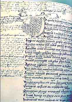
A glossed page from a 15th century German copy of Virgil. By permission of the University of Tasmania Library. | ||
| This example shows an untidy working copy of a Classical text, heavily annotated with both marginal and interlinear glosses. While the scribe has taken the trouble to create a large decorative initial, the general appearance is much more of a working study copy than a carefully constructed page layout. Note, however, that the original text is set out with plenty of room in the margins and between the lines for the additional text. We are often told that Latin words were abbreviated in many texts to save every inch of valuable parchment, but page layout often used parchment quite lavishly to provide the wide margins for annotations and glosses. Perhaps there are other reasons for abbreviation, but that is another story. | |||
| These aspects of page layout might be regarded as entirely functional solutions to problems of presentation of information rather than decoration. Nevertheless, there are aesthetic criteria that are being conformed to. There are proper ways of setting out bilingual text or glossed texts that make them visually pleasing and significant. Having the correct formal properties makes them works of importance. | |||
| Hypertext relationships were not only constructed by placing multiple texts on a page, they could be constructed with indexes or concordances. The most commonly found examples of this approach are the canon tables of a Bible. | |||
|
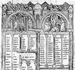
Upper part of a page containing the canon pages of a large late 12th century Latin Bible (Paris, Bibliothèque St Geneviève, MS 8-10, vol.III, f.129b). (From New Palaeographical Society 1907) | ||
| The function of these tables was to match up sections of the four gospels that referred to the same episode in the life of Christ. While they were constructed as a simple table with the chapter and verse numbers of the different gospels aligned in rows, somewhat like a modern spreadsheet, they were part of a decorative page with a certain prescribed formula. The tables were entered under an architectural canopy of Classical form, often with painted miniatures or decorative detail. Again, page layout has a specific function, as well as a particular aesthetic expectation. | |||
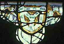
| Writing could escape its horizontal linear boundaries in diagrammatic representations which might be heavily annotated with text. Text appeared in scrolls or was occasionally even written around in circles. Although horizontal lines of text were the general rule, text and image could be integrated in visual representations. |
|
||
| This diagrammatic representation of the Holy Trinity is found in the upper lights of a 15th century stained glass window in the parish church of Thornhill, Yorkshire. | |||
| Thie above diagram has appeared in manuscripts, despite having been regarded as a heretical conception at one time. | |||
| The miniatures displayed in the Raimundus Lullus Ikonographie website include diagrams festooned with captions and scrolls attempting to explain philosophical concepts. | |||
| In summary, book page design was grounded in a conservative conception, to which were added various elements, the function of which was to render the text more comprehensible or accessible. All the page design elements, from enlarged initials to annotated diagrams, could be considered as practical solutions to problems of information presentation. They also enhanced the value of a volume and represented aesthetic values of their day. They are decorative, but not trivial. | |||
|
|
|||
|
|
|||
|
If you are looking at this page without frames, there is more information about medieval writing to be found by going to the home page (framed) or the site map (no frames). |
|||