If you are looking at this page without frames, there is more information about medieval writing to be found by going to the home page (framed) or the site map (no frames).
| Page Design | |||||
| In these days of the word processor there are those who assert that the conventions of laying out a page in single or double columns, justified to fit the space or ragged right, with everything in neatly arranged horizontal lines, are a relic of the industrial mode of book production. The technological limitations and demands of typesetting with oldfashioned movable type created a convention which we stick to, despite the fact that we are no longer constrained by those technical limitations. The earliest printers placed individual letters in frames, so everything was horizontal and regular, while lines of text had to be filled up with blank spacers or decorative line fillers to stop the letters from sliding about. However, the industrial mode of book production was just imitating conventions which were already in place when scribes wrote out books with a pen, and could theoretically have written all over the page in any way they liked. | |||||
|
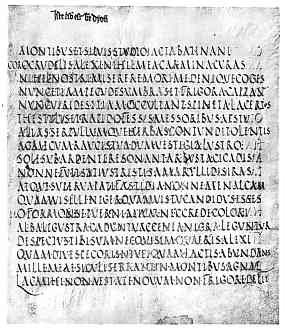
Page from a 5th or 6th century volume of Virgil (Rome, Biblioteca Vaticana, Vat. Lat. 3867). (From Steffens 1929) | ||||
| This very ancient page is laid out nearly as neatly and horizontally as if it had been set in movable type. What looks like a little heading at the top is, in fact, a centuries later medieval addition recording that the book belongs to St Denis. The script is rustic capitals, a script reserved for the finest and most valued of works in the post-Roman period. Despite the fact that the individual letters are big, clear capitals, it is not that easy to read rapidly, absorbing chunks of text, as we are inclined to do today. | |||||
| You can't really read the script at this magnification, but that is because we are concentrating on the appearance of the page. There are no spaces separating the words, although the words are, in fact, separated by dots. However, word spacing is not really part of the page design. To read the written code you must track with your eyes along each line of text, mentally or actually sounding out each word letter by letter. The design ensures that you are following a carefully laid out linear code. The high valuation of this work is signified by the meticulous and laborious script, and the work does contain a number of illustrations. | |||||
|
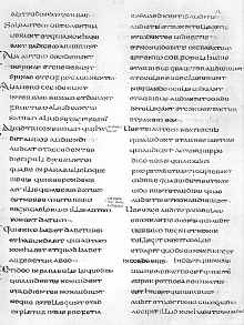
Page of an 8th century gospel (Durham, Cathedral Library MS A II 16, f.12). (From New Palaeographical Society 1905) | ||||
| This page from a gospel, written in uncial script, is neatly arranged in two columns of text. There is some word spacing but it is not really consistent. The use of columns means that they eye does not have track so far horizontally to follow the text, and my make it easier to read in chunks. Each paragraph begins with an enlarged initial to the left of the text block, in the format that our word processor menu would refer to as a hanging indent. These are visual aids for locating places in the text in a work that was used for oral performance. Modern technology is just copying a few tricks from the ancient monks of Durham. | |||||
| Throughout the middle ages, the process of manuscript production of books began with the preparation and layout of the page, utilising conceptually the same kind of grid system which I am using here in electronic format to prepare this page. Before the page was written on, the layout was prepared. First a whole quire of parchment was pricked with a line of holes to mark the spacing of the lines. These holes can sometimes be seen along the spine side of isolated leaves which have become separated from their bindings. These then served as guides for drawing up a grid on each page as guidelines for writing. In the early medieval period this was done by scoring the parchment, and is referred to as hard point. Later red lead was used, referred to as plummet. By the end of the medieval era coloured inks were employed, but the basic process was the same. | |||||
|
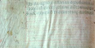
Blank page with red ink ruling from a 15th century book of hours (National Library of Australia, MS 1097/9). By permission of the National Library of Australia. | ||||
| This example shows a blank section of page with the grid drawn up in red ink. The very faint writing visible is actually showing through from the other side of the page. | |||||
| When pages were embellished with various elaboration other than lines of text, such as historiated initials, miniatures or elaborate headings, these were planned into the design of the page at the laying out stage. Examples exist of pages in which these additional elements have never been completed, but the spaces for them have been defined on the page. So while our medieval scribe or illuminator was not confined by his technology, he was restrained by a mental template of how a book should be. | |||||
|
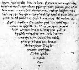
Concluding sentences of appended verses in a copy of St Gregory's Pastoral Care in Anglo-Saxon (Bodleian Library, Hatton MS 20, f.98b). (From New Palaeographical Society 1903) | ||||
| While scribes mostly adhered to writing in horizontal lines, very occasionally the vertical pattern was changed. Early Irish and Anglo-Saxon scribes occasionally made patterns on the page with the text, as in the example at left where the text tapers to a point. The script is a pointed insular minuscule. | |||||
|
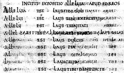
Segment from the 8th century Vespasian Psalter (British Library, Cotton Vespasian A1. By permission of the British Library. | ||||
| In the above example, patterning is created by the progressive shortening of the word alleluia, giving an emphasis to the repetition of the word as it makes a pattern on the page. The script of this sample is rustic capitals. | |||||
|
|
|||||
|
If you are looking at this page without frames, there is more information about medieval writing to be found by going to the home page (framed) or the site map (no frames). |
|||||