If you are looking at this page without frames, there is more information about medieval writing to be found by going to the home page (framed) or the site map (no frames).
| Inks and Colourings (2) | |||||
| Coloured inks were concocted from mineral pigments. Red lead was the basis for the red ink used throughout the medieval period for rubric headings. Blue and green inks also sometimes appeared in headings. | |||||
|
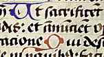
Red and blue initials in a 15th or 16th century psalter from Germany, from a private collection. | ||||
| In the above example, evidence that the red and blue initials were added after the main text is shown by the survival of a faint guide letter within the blue U. The letters show the marks of the split nib, indicating that they were executed with a pen, not a paintbrush. | |||||
|
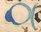
OK, so the nib marks do not show up so well on that scan, but here is a detail from another initial from the same manuscript that shows it better. | ||||
| Particularly in the early middle ages, metallic inks utilising suspended gold or silver were used for some manuscripts of especial prestige. | |||||
|
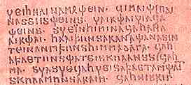
A rather horrid old reproduction of silver writing on purple dyed vellum in the language of the Goths, from the 4th century Codex Argenteus in Uppsala. | ||||
| A better image of a page from this manuscript can be found here on the Codex Argenteus website produced by Uppsala University Libraty. | |||||
| A lectionary on purple vellum using metallic gold ink, from the Bibliothèque Nationale de France (Manuscripts Department, Western Section, Lat 9451), is displayed in the "Creating French Culture" exhibition. | |||||
|
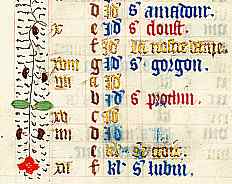
Coloured inks, as well as gold, were not only decorative. In this calendar page the saints' names are entered in gold, red or blue to form a hierarchy of significance for the feasts on the calendar. | ||||
| Segment from a calendar page from a 15th century French language book of hours. from a private collection. | |||||
| The pigments used for painting historiated initials, borders and miniatures were derived from coloured minerals. These were sourced from all manner of exotic ports and were of considerable commercial value. The minerals were ground to a fine powder and mixed with a carrying medium to create paints. Some colours acquired a high valuation because of the value of the materials used to create them, such as lapis lazuli blue which might be reserved for significant parts of the image such as the traditional blue robe of the Virgin. | |
||||
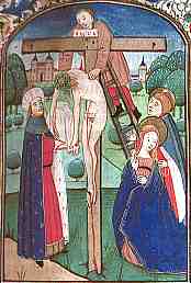
| The Virgin wears her traditional blue robe in this miniature of the Deposition in a 15th century book of hours (National Library of Australia, MS 1097/9, f.48r). By permission of the National Library of Australia. | |||||
|
Illustrators needed to know a great deal about the characteristics of their pigments in order to get good and durable results. This is the kind of knowledge that has been lost since we just trot down to the art and craft shop and buy it in tubes. Each colour had particular characteristics of hardness when it dried, for example. Complex effects were built up by painting in layers rather than by mixing colours together and it had to be known which colours would form a good base layer, for example, and in which order the colours could be laid on top of each other. Certain combinations would form a durable result, others would cause the paint to crack up as it dried. The presence of unfinished miniatures in some manuscripts has provided some information about how the colours were assembled on the page. | ||||
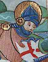
| Skin tones and details of clothing were achieved by painting in layers rather than blending colours. Detail from a miniature of St Gearge (National Library of Australia, MS 1097/9, f.17v). By permission of the National Library of Australia. | |||||
| The production of gold details in miniatures, as in the above example, or gold initials was not done with liquid pigment but with immensely thin sheets of beaten out metallic gold known as gold leaf. A pen or brush was used to apply gesso, a plaster compound, to the surface of the page to raise the area where the gold was to be applied. When dry, it was smoothed and rounded. The layer of gold leaf was then applied with great cunning and ingenuity to the gesso surface, which contained sugar and glue to help the gold adhere. The area was then carefully burnished with something smooth and hard, a polished stone or an animal's tooth, and the surrounding area cleaned with a knife or brush. The final appearance is of a shaped globule of liquid gold. (See Jackson 1981) | |||||
|
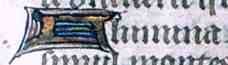
A gold leaf initial on a page from a 15th century book of hours. By permission of the University of Tasmania Library. | ||||
|
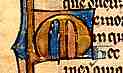
A gold leaf initial on a page from a 13th century Flemish psalter, from a private collection. | ||||
| In the second example above, from a heavily used page, the gold has partially worn off the initial, showing the gesso beneath, indicating that the gilded inital was a carefully crafted three dimensional object. In later medieval manuscripts, some gold initials were simply painted on with a liquid gold suspension. | |||||
|
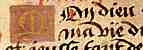
A rather sad little painted gold initial in a late 15th or 16th century French language book of hours, from a private collection. | ||||
| The Medieval Manuscript Manual website has more detail on the art of gilding. You can watch a YouTube video on polishing gold leaf below, or check it out on the You Tube site here. | |||||
| In the early part of the middle ages the artist-scribe who produced both the text and illustrations for manuscript works had to be an expert on all the materials in use. In the later middle ages, miniaturists were a specialised craft in their own right, while the scribe just kept writing, writing, writing. | |||||
If you are looking at this page without frames, there is more information about medieval writing to be found by going to the home page (framed) or the site map (no frames). |
|||||