 |
|
Gothic
Variations (3) |
| By
the 13th century there was a great increase in the production of the written
word in terms of books, documents, government records and private legal
matters and correspondence. Gothic
textura formed
a fine display script
for significant or prestige works, but more rapidly produced legible writing
was needed. A range of styles of cursive
develped for different purposes. These tended to hybridise and change
so that a great diversity of forms gradually developed. |
|
In
England, the script of chancery
documents became a cursive, known as cursiva
anglicana, around the late 12th and early 13th century. It had an
angular, prickly appearance at first, but developed a more rounded, loopy
appearance with clubbed ascenders
during the 13th century. It became simpler and more legible in the 14th
century with less elaborate loops. |
 |
|
Sample
of cursive chancery hand from the middle of the 13th century in the form
of an entry in the patent rolls (National Archives, Patent Rolls, 43
Henry III (73). |
| By
the late 13th century, cursiva anglicana was being used for books as well
as documents and by the 14th century a relatively formal variant, anglicana
formata, had evolved for book production. While Gothic textura was
reserved for important display books, cursive was increasingly used for
works which were written more quickly, such as chronicles or histories.
With the later increase in the use of the English language in literary
works, cursive script was used for the vernacular.
Cursive book hands also coincided with an increasing use of paper rather
than parchment. |
|
 |
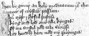
Cursive
book hand of the late 14th century in a poem Holy Meditation (British
Library, Egerton 3245, f.193), by permission of the British Library. |
|
With
increased governmental record keeping in the form of transcription
of charters and
other documents on to rolls,
the various writing offices within the royal administration tended to
develop particular house styles. These are often referred to as court
hands. The exchequer
and the chancery were the first to develop distinctive hands during the
12th century, but the more distinctive house styles tended to emerge in
the 15th and 16th centuries. |
|
On
the continent of Europe, document
hands were influenced by the calligraphic
cursive produced by the papal curia. The simplification of this hand,
reducing the exaggerated ascenders and descenders,
produced many variations of cursive style. These tend to be referred to
by European paleographers
as diploma hands
or diplomatic
minuscule. |
 |
Sample
of diplomatic minuscule from a diploma of Rudolf of Hapsburg, 1275 (Freiburg,
Staatsarchiv, Diplome 41). |
|
By
the 14th century the French chancery was producing a distinctive cursive
script termed Secretary.
This was introduced into England and Germany in the late 14th century
where it was used as a book
hand. It is an angular script with elaborate curled ascenders, and
it is distinguishable from the cursiva anglicana with which it co-existed. |
 |
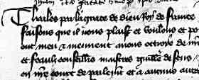
A sample of French Secretary hand, from the registers of Parliament (Archives Nationales, X1a 8602, f.138v). |
|
In
Spain the book hand known as Spanish
round hand or redonda de libros, was also a cursive derived from a
stylised document hand in the late 13th century. It joined a range of
types and grades of Gothic, often related to Gothic rotunda,
as book hands in use in that country. |
|
Cursive
styles were employed for personal handwriting as a steadily increasing proportion
of the public became competent in writing. Informal styles of cursive are
found in personal letters, domestic records and other private domains in some
quantity by the 15th century. |
|
|
The
cursive book hands underwent various levels of hybridisation with Gothic
textura to produce a range of scripts of mixed characteristic, known elegantly
as bastarda scripts.
The precise terminology of this family of scripts is exceedingly entangled
as the diversity of forms produced by the process was great. By the 15th
century, most books apart from the most formal display volumes were produced
in some form of bastarda. |
 |
Sample
of a bastarda book hand from Hoccleve's Regement of Princes composed
in 1411-12 (British Library, Harley 4866, f.88), by permission of the British
Library. |
|
In
England, two broad types have been recognised; bastarda
anglicana which appeared in the mid 14th century, and Bastard
Secretary which appeared later and was derived from the imported Secretary
hand. A French version of some formality is known, for added confusion,
as Bâtarde.
However, these processes of hybridisation between document and book hands
all over Europe led to a great diversity of writing styles in the 15th
century.
|
 |
Sample
of Bâtarde script in a mid 15th century work on the Conquests
of Charlemagne (Brussels, Bibliothèque Royale MS 9066-68). |
|
The
hybridisation process also affected document hands. The English chancery
hand of the 15th century is a form of bastarda as the looped appearance
gave way to a more angular and less cursive style. |
|
|
English
chancery hand in a petition of 1439 (National Archives, London, E28/59/57), by permission of the National Archives. |
|
In
the 15th century Gothic book hands were replaced in Italy and neighbouring
areas which had favoured the rotunda form of Gothic by the humanistic
scripts. However, in some areas, particularly Germany, Gothic textura
survived into the era of printed books. Books with Black
Letter Gothic typefaces were produced in the late 15th century, and
this tradition survived in German book production until well into the
20th century. |
|
|
 previous
page previous
page |
 History
of Scripts History
of Scripts |
 What
is Paleography? What
is Paleography? |
|
 |
 |
 |
 |
 |


