 |
|
Gothic
Variations (2) |
| From
the 13th century to the end of manuscript
book production in the late 15th and 16th centuries, Gothic
textura became,
in a minor range of variants, a relatively standardised form of book
hand. Initially used for all types of books, it gradually became more
restricted and by the mid 15th century was mainly confined to larger and
more formal volumes, such as Bibles,
psalters or missals
for public use in church. More rapidly written compact and cursive
hands were used for less formal or smaller productions.
|
 |
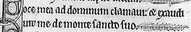
Gothic
textura in a late 12th century Bible (Paris. Bibliothèque St Geneviève,
MS 8-10). |
|
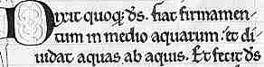
In
the highly angular form of Gothic textura used in France, England and
Germany, the script became very upright and compressed. In its fully developed form, certain
letters are joined by sharing upright strokes, a process referred to as "biting of bows". |
|
Sample rom a late 13th century copy of the Historia Scholastica of Petrus Comestor (British Library, Royal 3D VI, f.234). |
|
In the above example, the
letters d and o are conjoined in the word sacerdotum. |
| The appearance is very dense and neat but it can be difficult to read, particularly in the less formal and more compressed variations. Small letters are formed from a series of short hooked upright strokes called minims. This can lead to particular problems in sorting out the letters i, n, m and u when they appear grouped together. |
 |
The antique
Roman majuscule
scripts were abandoned for display headings as Gothic developed its own
elaborate capitals. These could develop fine and spidery penwork decorations, or be enhanced with coloured painted designs or gold leaf for added significance. |
|
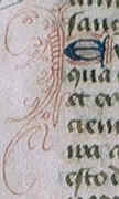
Intricate
capital letter on a leaf from a 15th century book of hours, by permission
of the University of Tasmania Library. |
|
Paleographers employ an impressive array of Latinate technical terms to designate variants
of Gothic textura and also what they term grades, or degrees of formality
of the hand. While these ought to be able to provide a comprehensive classification
system, there is some variation in the terms and their use. It is also
an attempt to place into categories something which actually exists as
a continuum. The number of categories is at the discretion of the classifier;
it does not represent an actuality in terms of discrete classes which
any trained eye could distinguish. |
|
One
of the most formally constructed types of Gothic book hand is known as
textura quadrata,
or textualis
quadrata. In this form of script, the bases of the letters have neatly
constructed angular feet with a narrow hairline shooting off diagonally
from the base. This is also commonly known as Black
Letter Gothic. It was the type adapted for print typefaces and may
still be found in newspaper titles. |
 |
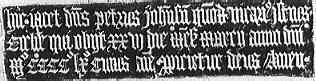
Textura
quadrata in a 13th century psalter from a private collection. |
|
Textura
quadrata or Black Letter Gothic also became the standard script for inscriptions,
either in stone or brass funerary memorials or on stained glass. |
 |
Rubbing
of an inscription on a funerary brass of 1460 in Bishop Burton church, Yorkshire. |
|
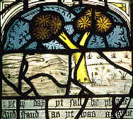
Panel
of a stained glass window in All Saints, North Street parish church, York. |
|
| The example at right illustrates a poem, The Prick of Conscience, and shows the last days of the world. Lines of the poem appear in Gothic script in the English language beneath each panel. |
|
Textura
prescissa, or textualis prescissa, is also a highly formal book hand
in which the bases of letters are cut off straight, parallel to the marking
lines. This style was reserved for very formal volumes as the penwork
is laborious. It is also called textura prescissa sine pedibus, referring
to the lack of feet. |
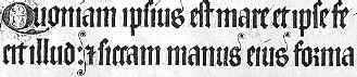 |
Textura
prescissa as displayed in the 14th century Luttrell Psalter, now in the
British Library. |
|
Textura
rotunda refers to a Gothic book hand of less formal grade in which
the bases of the letters are finished not with formal feet, but with a
simple upward flourish. This is not the same as the rotunda
script of northern Italy. Ambiguities of nomenclature are rampant in paleography.
An intermediate grade in which some letters are finished off with feet
and others only with a flourish can be termed textura
semi-quadrata. Within each of these grades, terms are used to designate
the size and precision of execution of the script. For example, the term
formata is used
to designate a very well executed and formal script. |
|
From
the 12th century onward, smaller and slightly simplified variants of Gothic
textura were introduced for the glosses,
or commentaries which accompanied the text of many works, and for smaller
books such as the miniature Bibles of the 13th century. These scripts
were more rapidly written and very compact.
|
 |
Sample of text from a Bible of the early 13th century (British Library, Arundel MS 303, f.56b). |
| This example shows the tiny letters, multiple abbreviations and somewhat simplified letter forms in a script which has no cursive qualities. |
|
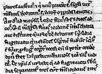
The
universities of Paris and Oxford produced their own variant, very dense
and highly abbreviated, for the production of heavily glossed textbooks.
At the university of Bologna, the script for textbooks was a variant of
rotunda, retaining the roundness of the Italian script but highly abbreviated
and packed into tightly spaced lines. It has been dignified with its own
title, littera
Bononiensis, or littera Gothica textualis rotunda Bononiensis for
those with a preference for more generous and flowing classificatory titles. |
 |
A
more rapidly written and abbreviated style of Gothic textura from a collection
of legal proceedings, from a private collection. |
|
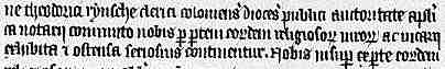
A
very plain and rapidly written Gothic script which has no cursive qualities
has been designated scriptura
notularis. It was used for such things as legal and medical texts.
However, the increasing usage of the written word required the development
of more rapidly written scripts. |
|
continued |
 previous
page previous
page |
|
History
of Scripts |
| What is Paleography? |
|
 |
|
|
|
|
|
|