If you are looking at this page without frames, there is more information about medieval writing to be found by going to the home page (framed) or the site map (no frames).
| The Strange History of Humanistic Minuscule | |||
| On casual acquaintance, it might seem that the history of handwriting styles is a simple history of changing letter forms, which are arranged in sets that can be neatly classified with identifying script names. Once you learn the letters and know the language, you can read the writing, and that's that. However, the history of handwriting embodies coded messages about the history of politics, culture and learning, not only of the people who did the original writing, but also those who more recently studied and classified it. Who called it humanistic minuscule anyway? It implies a whole mindset about the history of the middle ages and the Renaissance: before 1400, total absorption with angels and a miraculously procreating Virgin; after 1400 in Italy, people get invented! OK, so that is simplistic and stupid, but so is the term humanistic for a particular kind of handwriting that in itself, holds no philosophical position. But we are looking at the end of the story, so let us go back to the beginning. | |||
| And yes, we go right back to Rome, which had a huge empire and a high level of literacy. Our basic alphabet letters derive directly from here, although their forms may have periodically changed. The Latin language remained in use throughout the medieval period, despite what some might claim about it being a dead language. It wasn't. The Christian religion was founded within this empire, developed status as the official religion and set up the heart of its organisation and bureaucracy in Rome. Just to emphasise all these connections, the arch pictured at left was built to celebrate the quelling of rebellion and reconquest of Jerusalem by Rome in AD 70. | |||
| The Arch of Titus in Rome. | |||
| Rome wasn't built in a day, nor did it collapse in a day, but over a number of centuries it started looking pretty sick, and large hunks of the empire were gradually abandoned to what are often referred to as barbarian hordes. That is to say, they did not live in towns with luxuries like running water, they were illiterate and they were not Christian; and yes, they had beards. The church during this period functioned very much as a supra-national entity, with outposts of missionising monks dotted here and there, forming a literate culture with their common language, Latin, which was not dead. The church was a series of literate enclaves, sometimes embattled, in a sea of cultural and linguistic change. Individual enclaves in the monasteries developed their own house styles of writing, mannered and heavily ligatured. These are often called, highly inaccurately, the National Hands. They were no more national than Latin was dead. | |||
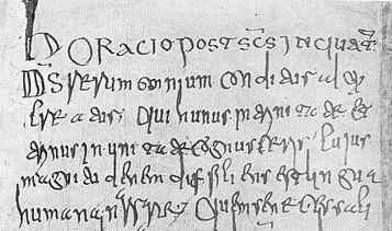
| Sample of script from an 8th century missal which had belonged to the abbey of Fleury (Vatican Library, Regin. 317, f.136v). (From Ehrle and Libaert 1932) |  |
||
| This particularly horrible example shows what writing could be like around the 8th century. It could be classified as Merovingian minuscule. | |||
| If you want to have a crack at decoding it, there is a script sample and paleography exercise for this example on this website. | |||
 |
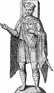
The rising dominance of certain Germanic tribes which resulted in the formation of the spacious empire of Charlemagne started a power rivalry between the church leaders in Rome and the secular Germanic leaders which continued for centuries. In fact, it may be going on in EU summit meetings right now for all I know. However, in the area of literacy, they had a period of collaboration. The German emperor, despite his determination to identify himself by Frankish clothing, admired the literary culture of Rome. It seems he rather fancied himself as a kind of Roman emperor. Reforms to ecclesiastical handwriting which made it more uniform and legible have been designated with his name. The new reformed script of the era is now called Caroline minuscule or Carolingian minuscule in his honour, even if, according to his biographer Einhard, the emperor's practical literacy may have been more aspirational than actual. | ||
| Depiction of Charlemagne in Frankish clothing, from an ancient mosaic. | |||
 |
|||
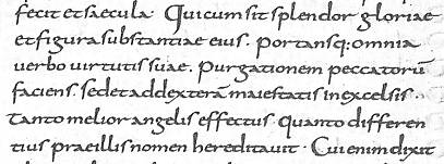
| Segment from a Vulgate Bible as revised by Alcuin of York, written at Tours around the middle of the 9th century (British Library add. ms. 10646). (From Fairbank 1952 ) | |||
| Now we are still a long way from 15th century Italy, but take a long hard look at the example of Caroline minuscule above, especially compared to the previous Merovingian example. You can actually read it, right? One reason for this is that the letter forms are mostly very familiar. Only the tall s and the open g are actually different to the letters in the font that I am typing in now. So did writing stop changing at this point? Obviously not, or we wouldn't need to learn paleography. It was simpler than its predecessors because it had no ligatures and the forms of individual letters were entirely consistent. It had word spacing and punctuation. As discussed in other sections, this made it easier to read, and easier to learn to read, but perhaps as a slow process as the reader worked phonetically along the straight lines of text. (See Parkes 1991, Parkes 2008) This was not just a change in the shapes of letters, but in the nature of reading. Just hold that thought and we will eventually get to the 15th century. | |||
| There is also a script sample and paleography exercise for this example, if you are feeling assiduous. | |||
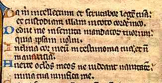
| The nature of the change from Caroline minuscule to Gothic textura has been examined in the section on The History of Gothic Book Hands. In terms of style, letters became more squashed and angular, with shorter ascenders and descenders. Letter forms did not change substantially, except that the ascender of d was shortened and tipped over at an angle. Two new letter forms were introduced; the short curly s at the ends of words and the simplified form of r that appeared after vowels, particularly o. The conjoining of letters which bowed towards one another, such as de, do, pe, po, produced combinations that look suspiciously like the return of ligatures. The one to one relationship between each letter and its unique form was busted. As written output increased, abbreviation was employed, often to a prodigious extent. The reader was back to recognising whole words, not sounding out lines of phonetic signs. Texts acquired glosses, which were prescriptive instructions on how to interpret the text being read. Absorb, remember, assimilate, but do not explore and interpret too much. This literate process was happening within the medieval church, which had periodic fits of anxiety over the centuries about inappropriate interpretations of texts. | |||
 |
Sample from a page of Gothic textura from a 13th century psalter from Flanders, from a private collection. | ||
| You can work through the script sample and paleography exercise for this example as well, if you are really in the mood. | |||
| The above example represents Gothic textura as it developed in the northern parts of Europe, such as northern France, the Low Countries, Britain and Germany. It wasn't quite the same in Italy and the rest of the Mediterranean area. | |||
|
|
|||
|
If you are looking at this page without frames, there is more information about medieval writing to be found by going to the home page (framed) or the site map (no frames). |
|||