 |
|
Calligraphy
(2) |
| The
reform of scripts
which spread Caroline
minuscule over most of western Europe by the 10th century can perhaps
be seen as a reform of legibility at a time when society was becoming
increasingly dependent upon the written word. It was no longer enough
to have a charter,
you had to know what it said. In both continental Europe and Britain the
new script was adapted for significant documents, although in Europe exaggerated
ascenders and
descenders were
still employed to add a litle extra flourish to important documents. |
|
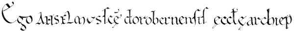
| The
beginning of a charter from the reign of William II. |
| The script of the above example is a neat but not overembellished Caroline minuscule. The name ANSELM is in slightly fanciful uncials. |
| The
papal curia, having adopted the more legible reformed script with the elaborated
ascenders, proceeded to find new and interesting ways to make their documents
bizarre and unique. Peculiar letter spacing within words contived to reduce
legibility. |
|
| Segment from a papal bull of Pope
Eugenius III of 1147 (British Library, Cotton Cleopatra E 1, f.123). |
| The simple word est is attenuated in the above example.
This strange stretching of the st combination occurs throughout
the document and other papal documents of high significance. |
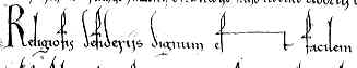
| Highly
compressed headings were another calligraphic
trick to make the significance of the document immediately apparent, even
to those who could perhaps not read it with facility. |
 |
Part
of the heading of the papal bull above. It reads:
Eugenius
ep(iscopu)s seruus seruoru(m) d(e)i, dilectis filiis rogero ......... |
| Tiny
minuscule letters
with tall ascenders and descenders and highly compressed headings became
a feature of European diplomas,
and the more important they were, the more exaggerated these odd features
became. |
| When
Caroline minuscule was used as a book
hand, the way to make it important was simply to make it large, round
and neat. The prestigious Bible
or psalter still
had to be able to be read from the lectern. |
 |
| Rounded
and bold form of Caroline minuscule in the late 10th century Ramsay Psalter
(British Libary, Harley 2904, f.181), by permission of the British Library. |
| The
changes which occurred around the 12th century generated a diversity of
scripts. Formal Gothic
scripts which looked impressive competed with cursive
scripts which were quicker and easier to write for the increasing volume
of words being generated. These hybridised to produce new forms which
allowed rapid writing but with added flourish. Document
hands in England went through a whole series of fashion changes; from
spiky and prickly to neat and rounded with large wavy ascenders and descenders,
to loopy and curly, to neat and angular. Whatever the script style employed,
the way to give a legal document a touch of class was to add a few fanciful
embellishments to the capital letters. It probably stopped you from being
bored to death if you were a chancery
clerk, churning out dozens of letters purporting to be from the king. |
|
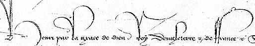
| Segment from a 15th century royal warrant (National Archives, London, C81/662/483), by permission of the National Archives. |
| While the script of the above example is a neat chancery hand, the scribe has got quite carried away with the capital
letters in the name and honorifics of the king. |
| In
book production the most elegant calligraphy was used in the grand books
of church liturgy,
utilising the more precise forms of Gothic textura.
When produced in a broad and bold form, this is very legible, but when
laterally compressed, as the script tended to become at times, the lines
of hooked minims
can make the separations of letters confusing. The classic calligrapher's
exercise is to render the word minimum in Black
Letter Gothic. |
|
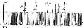
| A
calligrapher has fun with Black Letter Gothic. |
| Old
paleography books tend to refer to any large, rounded, neat and legible book
hand, whatever its script style, as a "fine liturgical hand", indicating
that, whatever complex classificatory system might be employed to categorise
the script, the needs of the church ritual stayed the same over many centuries.
The calligraphic qualities required to fill those needs were therefore similar. |
| Printed
books perpetuated the forms of the finest types of book calligraphy of
the end of the middle ages in their typefaces derived from the humanistic and Black Letter Gothic scripts. Typefaces tended towards the "fine
liturgical" style of maximum legibility, as by this time books were
definitely meant to be read. |
|
|
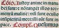
Sample
of Black Letter Gothic printing on an isolated leaf , by permission of
the University of Tasmania Library. |
| Document
calligraphy survived much longer, until the invention of the steel nibbed
pen allowed for the extravagant flourishes of copperplate writing and writing
masters published great volumes of their diverse styles. It was all getting
very late and decadent by then. |
 previous
page previous
page |
|
Decoration |
|
 |
|
|