 |
| Calligraphy |
|
The
procedure of writing itself could add decorative effect to a manuscript.
Elegant and laboriously produced penwork could add value to a document;
not just monetary value, but social value. Just as a fine display work
of church liturgy
might be seen as having greater social value than a practical but useful
book of sermons for a parish priest, so a royal, imperial or papal charter
might be seen as having greater social value than a book of accounts or
a manumission of serfs. Within the various traditions of their times,
scripts can be graded according to this social valuation. |
|
Calligraphers
and paleographers
who study the way in which the scripts
were created in order to answer historical questions establish what they
call the ductus.
This represents the technical aspect of production of the script, involving
understanding how the pen was held and the order and direction of the
strokes used to make each letter. |
1. 2. 2. 3. 3. 4. 4. 5. 5. 6. 6. |
| An
example of the ductus of a capital letter N in early Gothic script. The red
arrows represent the direction of the strokes as the letter is built up. |
|
Strange
as it may seem, no matter how carefully you try to copy the shapes of
letters, if you don't have the ductus right, they don't look the same.
This indicates that a scribe
in training was learning not only the visual skills of letter recognition
and reproduction, but very specific sequences of motor skills. |
|
In
the earlier part of the medieval period, the use of elaborate calligraphy
in the production of legal documents did not enhance their legibility.
Merovingian
chancery script, Ravenna
chancery script and papal curialis
all had in common a compressed and elongated form with extravagant ascenders
and descenders.
It looked all very impressive, but it is actually very difficult to read. |
|
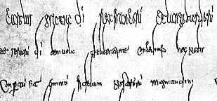
| This
is a little grab of Merovingian chancery script from a diploma of Charlemagne
from AD 781 (State Archives, Marburg). |
| Even the large letters of the heading above are squashed while the long curving ascenders get entangled in the words of the line above. It begins: Carolus gratia d(e)i rex Francoru(m) et Langobardoru(m) ... which I owe to Dr Steffens as I would not have worked it out if I stared at it for a fortnight. |
|
We
tend to think of legibility as being paramount in legal documents. Before
one signs one's life away on a mortgage, one reads the fine print. But
our culture is based on the primacy of the written word and its literal
interpretation. You didn't understand clause 15 before you signed? The
debt collector will be around tomorrow. These documents were tokens of
good faith in which an understanding of a legal arrangement is ratified
by the production of a ceremonial and significant object. The king did
not sneak in trick clauses. The document was delivered open for anyone
to see and had its official seal.
More than likely the messenger would read it aloud to you. The calligraphic
writing was a further insignia of its authenticity. Most of the content
was ceremonial persiflage anyway, with the significant legal substance
as a short sentence buried in the middle of the main paragraph. |
|
The
finest display works of the early church also used elegant calligraphy
to enhance their appearance, but these were works which were used for
reading aloud in the performance of ritual. The writing had to be legible.
The production of an entire work in uncial
script would have been a laborious procedure, but the result was not a
token. It was a book which could sit on a lectern in a dimly lit church
and still be read by the priest. |
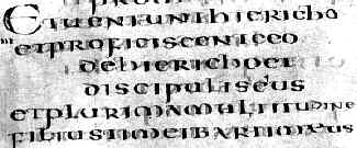
| Text from a 6th century Italian gospel (British Library, Harley 1775), by permission of the British Library. |
|
| While
the letters in the above example are large, well spaced and clear, note that there is no spacing
between the words. This suggests that there is an assumption that the priest
knows much of this by heart, otherwise the reading aloud process would be
painful and laborious. |
|
The
various scripts derived from New
Roman cursive, designated the National
hands, tended to favour speed of writing over display qualities. However,
the insular
family of scripts which were developed in Ireland and northern England
were also used as a calligraphic display scripts. These also had their
origin in liturgical use and the most formal of them, insular
half uncial and insular set
minuscule, were designed for legibility. The adaptation of these scripts
for document
hands in Britain meant that English charters and other documents had
a somewhat different appearance to diplomas
from the continent of Europe, although their function was similar. |
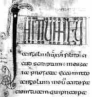 |
8th century gospel (British Library, Royal 1 B VII, f.55), by permission of the British Library. |
|
In this gospel book, the letters are rounded, bold and clear. However
there is a great deal of abbreviation and the unique display script for
the heading, which includes the bird's head as a capital I, suggests again
that this was a prompt for a well known passage.
It
begins: INITIUM
EVangeliiihuxpi filiidi or
Initium evangelii
iesu christi filii dei |
|
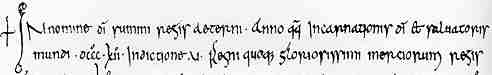
| Part of a charter of 812, of Coenwulf, king of Mercia. |
|
The insular minuscule script in the example above is the same as would have been used in a
work of religious writing, but then it was most likely produced by a monastic
scribe. |
|
continued |
 Decoration Decoration |
|
 |
|
|
|