|
|
 |
| The History of i |
|
The letter i must have the most uneventful history of the whole alphabet. Basically, an i is an i is an i. The only real problem can simply be the identification of such a minimalist letter among others which are made up of similar elements. In most medieval scripts, and certainly in all early scripts, i is not dotted, which can help it to get lost in a word.
|
 |
In the Old Roman square capitals, I has short horizontals at each end. |
 |
In the rustic capital script, it appears slightly asymmetrical. |
 |
The uncial I here has a fine horizontal crossbar at the top and an oblique base. |
 |
In this example of New Roman cursive, the minuscule i takes a minimalist form. |
| In the pre-Carolingian minuscule scripts or National Hands, the only differences in the form of i relate to minor variants in the treatment of the top and bottom of the letter. |
 |
In a 6th century half uncial script i is fairly tall. |
 |
In the specialised book script Corbie ab it has no eccentric features. |
 |
In an old northern Italian book hand of the 8th century it is tiny. |
 |
This example of Merovingian
minuscule or Germanic
book hand has an i with little feet top and bottom. |
 |
Even the specialised book hand Luxeuil minuscule cannot think of anything peculiar to do with i. |
 |
The Visigothic script has added a wedged top to i. |
 |
The formal script known as known as insular half uncial also has a wedged top for i. |
 |
This 10th century example of insular minuscule displays the wedged top and a foot for i. |
 |
In this example from a developed form of Beneventan minuscule the letter i is slightly curvy. |
 |
In Merovingian chancery script the letter i is taller than other small letters. |
 |
Even in the old curialis of the papal chancery, i has a familar shape. |
| The standard i of the Carolingian scripts had an asymmetrical form, kinking opposite ways at the top and bottom. |
 |
This i is from a very formal version of Caroline minuscule. |
 |
This sample comes from a forged 12th century monastic charter using Caroline minuscule script. |
 |
This is from the later papal curialis of the 11th century. |
 |
In 12th century diplomatic minuscule of the papal chancery, the letter is very tiny, as are other small letters. |
 |
In 12th century diplomatic minuscule of the Imperial German chancery it is also a tiny, minimalist letter. |
In the development of Gothic book hands, letters became laterally compressed and certain letters were constructed from repeating segments called minims. The letter i comprised one minim, n, u and v had two minims and m had three. When any combination of these letters was juxtaposed, it became difficult to disentangle them. The letter i began to be dotted, but not all the time. Even within the one piece of handwriting, i was sometimes only dotted if it was doubled, or adjacent to other letters constructed from minims. The dotting was usually a fine diagonal slash, which can sometimes be quite hard to see. Also, when the letter i was doubled, as in words like filiis or aliis or in lower case Roman numerals, the second i was often extended down below the baseline, which made it look like a j, but it wasn't a j, it was an i. That is the next story.
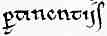 This shows the double i in a 12th century protogothic charter hand in the word p[er]tinentiis. This shows the double i in a 12th century protogothic charter hand in the word p[er]tinentiis.
|
 |
This protogothic i from a 12th century French book hand appears as a simple single minim. |
 |
The 14th century Gothic rotunda version of the letter has a fine diagonal slash in this example. |
 |
This 13th century Gothic textura i of medium grade also has a fine diagonal slash to dot it. |
 |
The very formal Gothic prescissa, displays has an i with a neatly angled top and a very fine hairline diagonal slash for a dot. |
 |
A relatively informally written late 15th or early 16th Gothic textura script has a dotted i in this example. |
 |
A 15th century Dutch language formal Gothic textura i lacks a dot in this case. |
| In document hands and later cursive scripts, it can become even more complicated to untangle the letter from the word, even though the form of the letter is uncomplicated. |
|
 Histories of Individual Letters Histories of Individual Letters |
|
|
|
History of Scripts |
| What is Paleography? |
|
 |
|