

If you are looking at this page without frames, there is more information about medieval writing to be found by going to the home page (framed) or the site map (no frames).
| The History of Gothic Book Hands (5) | ||||
| The script which was used in the English royal chancery from around the 13th century has been dubbed cursiva anglicana. I will leave you to work out why for yourself. It was a cursive script with some distinctive letter forms, but tended to change quite notably in style over the centuries, particularly in relation to the more extravagant calligraphic features which characterised significant documents such as royal charters. In a rapid, galloping summation, it went from a loopy form to a neat pointy form, and finally came back to a more angular Gothic hybrid. Variants were used for different purposes. There is no place or time where everybody writes the same. | ||||
 |
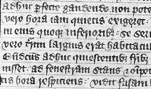
Small random grab from a page of an encyclopedic work Omne Bonum, of the mid 14th century (British Library, Royal 6 E VI, f.15v), by permission of the British Library. | |||
| The work from which the sample at left was taken is a huge compendium in two volumes on canon law, theology and other material. | ||||
| While the script is not written in a cursive manner, there are letter forms taken from cursive anglicana. You can find, for example, the short rounded s with closed lower loop and open upper loop, the d with curly closed ascender, the open r which hangs below the line, the raised a, the h with curved ascender and descender. Interestingly, these forms are sometimes alternated with the conventional Gothic forms. The letters, although small, are neatly spaced out and there are no minim muddles. It is a genuine hybrid, or hybrida if you want to be paleographical about it. | ||||
 |
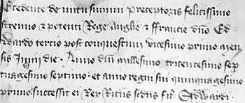
Segment from a page of a work setting out the procedures for the coronation of Richard II (British Library, Cotton Nero D VI, f.65), by permission of the British Library. | |||
| The above example shows a neat little pointy almost cursive script which differs very little from some that can be found in contemporary charters of the late 14th century. Look at the last word Edwardi, and its partner Edwardo that dribbles from line 2 to line 3. Kings called Edward got very lavish treatment of their names in English documents, as they really liked to go to town on the w. There must be some sort of historical hypothesis that can be generated from that. | ||||
| The variations on this theme are legion. Suffice to say that while grand liturgical books and books of display continued to use Gothic textura as the fine bold script of the top end of the scale, the sheer quantity of material being written by and for so many more people meant that cursive books hands were used for many other kinds of books. These were not simply poor and scruffy things however. These developed their own kind of elegance. | ||||
| This passage comes from a 15th century copy of Thomas Hoccleve's Regement of Princes, composed around 1412 (British Library, Harley 4866, f.88). By permission of the British Library. |  |
|||
| The above example exactly resembles the chancery bastarda used in the 15th century for all manner of documents. It is elegant, legible, cursive and even has some regularity, if not familiarity, of spelling. The chancery was teaching all manner of people to write. Now here is something interesting. | ||||
 |
Segment of a leaf from a 15th century English breviary, possibly from Croyland Abbey, from a private collection. | |||
| The breviary leaf, as sampled above, obviously from an unglamorous working copy rather than a fancy display volume, is written in a form of chancery bastarda rather than the more usual Gothic textura. So the chancery scribes were even teaching the monks to write, or perhaps the monks were going to professional scribes who had been taught the chancery method. | ||||
| As more people became literate in writing, some wrote out their own books. The differences between formal book hands and ordinary personal handwriting became one of neatness and correctness rather than large differences of style. | ||||
 |
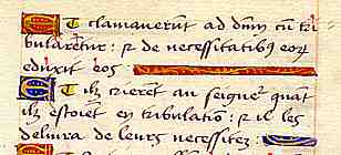
Psalm text alternating in Latin and French, 15th or 16th century, from a private collection. | |||
| The example above has me intrigued. The script is a nice but unspectacular French cursive and it is from a volume in which the verses of the Psalms are given first in Latin, then in French translation, suggesting that it is a volume for teaching the meaning of the Latin Psalms. But if it is somebody's private piece of individual work, they have gone to a lot of trouble with the gilt initials and line fillers. | ||||
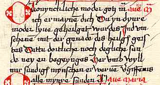
| Segment of a leaf from a 15th or 16th century book of hours or prayer book in a Low German or Dutch dialect, from a private collection. |  |
|||
| Equally, the example above, also a vernacular text, is in a cursive Gothic script that, while perfectly legible, is rather ordinary in terms of neatness and aesthetics. Perhaps this represents the kinds of personal prayer books that have survived less well than the lavishly decorated and beautifully penned books of hours. | ||||
| In Italy, notarial cursive scripts also hybridised with book hands to produce new and beautiful scripts for books. But we don't call that Gothic any more, because of a mythical event called the Renaissance which was supposed to have changed everything. So we will save that for another story, but it is the same story really. The newfangled scripts of Italy were known as humanistic minuscule, which is as silly a name as any of the other silly names used in paleography. | ||||
| The Gothic scripts survived until the age of printing. The earliest printed books were experiments in the use of various models for typefaces, including Gothic and the French bâtarde styles, but the humanistic script models won the day eventually, although it took much longer in some places. What you are reading here on the screen is yet another reinvention of Caroline minuscule. Just imagine, thirteen hundred years on and we still cannot come up with anything better, no matter how many hundreds of years we spend experimenting around. | ||||
|
|
||||
|
If you are looking at this page without frames, there is more information about medieval writing to be found by going to the home page (framed) or the site map (no frames). |
||||