Script Type : minuscule
Date : 12th to 15th centuries, this example from the 13th or early 14th century (probably).
Location : Spread from France and the Low Countries across western Europe. This example is of unknown origin, but it looks as if somebody who owned it may have been English.
Function : Book hand
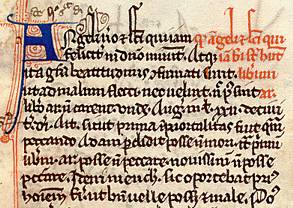


Distinctive letters : This is an interesting example of Gothic textura or textualis, as it is not a script designed for large and clear display, but a very dense, highly abbreviated example of a scholarly text, the major theological and philosophical work of the 12th century writer, Peter Lombard. There are a number of other fascinating aspects of this orphaned page which you can see by going to the paleography exercise, but just for now we will concentrate on the nature of the main script. If you thought that Gothic book hand was basically easy to read, you may be in for a bit of a surprise.
In general, the script is rather cramped and uneven, and ascenders and descenders tend to be slightly taller with respect to the smaller letters than one finds in the display style of textura. Perhaps this helps to make the tightly packed script more legible. I guess the classifiers of Gothic script would call this a semi-quadrata, as the bottoms of letters seem to randomly sport messy little feet or else less formal upward flicks. However, we won't go into the minutiae of classification here.
Ascenders of b and l tend to have notched tops.
The letter a is single chambered with an open curl at the top, echoing the uncial form. This is supposedly a variant which disappears after the 13th century.
The letter d mostly has the Gothic form with a backsloping ascender, but the odd example of the Caroline minuscule style of d with upright ascender appears.
There are two forms of r, and the simplified form is used extensively, not just after vowels.
There are two forms of s, the long and the short. The short form, which appears at the ends of words, has an informal open quality.
As usual, i and j are identical, and both may be dotted with a fine oblique slash, but not always, usually only to differentiate them from other letters with minims.
The letters u and v are generally not differentiated.
There are many conjoined letters, some with the standard Gothic forms as in pe or po. In other cases, the whole arrangement just looks squashed.
For a quick look at how it works, pass the cursor slowly over the lines of text. Be aware that the red writing which appears as a triangle in the right hand corner is a rubric heading which is read before the main text. For a more detailed look at the page and some of its interesting features, proceed to the paleography exercise.
Paleography
exercises using Flash![]()
Requires at least the Flash 5 plugin
If you are looking at this page without frames, there is more information about medieval writing to be found by going to the home page (framed) or the site map (no frames).