Script Type : minuscule cursive
Date : 15th century
Location : France
Function : document hand
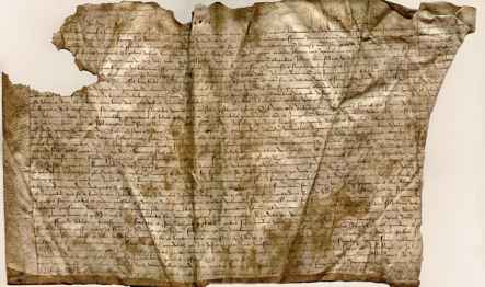


Distinctive letters : This is a descendant of the French Secretary style, but a bit more simplified and untidy than the elegant stuff produced by the royal chancery. It has the stylish flourishes of long ascenders and descenders, sloped or curly.
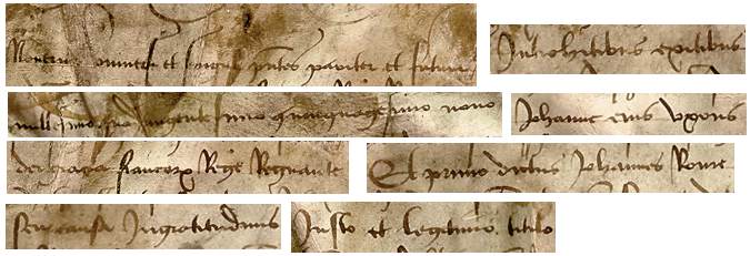
Notably, long s is tall and sloping, extending well below the baseline, with a curled top. The letter f seems to be mainly differentiated from s by having the top curl extended into a closed loop. The short and curly s found at the ends of words has been simplified to a simple upward loop. As simple loopy flourishes at the ends of words are also used for abbreviation, this can be a bit confusing.
The letter d can have a straight backsloping ascender, particularly when found at the beginning of words, or a loopy ascender and open lower loop. The ascender of l can also be straight or loopy, although that of b seems to be always straight and vertical.
The letter g has the Secretary form of an open letter, like a y, closed with an extended horizontal stroke. The descender of q curves the same way as that of g, but it has a rather angular closed top.
The smaller letters are dificult. The letter a has the simple one chambered form. The letter e mostly has no closed loops and can look a bit like r, and c can look like an r as well. The letter r itself is simplified into a form which sometimes looks like z, and sometimes looks like a Gothic simplified r and sometimes looks like a squiggle. The letters with minims line up in little jaggy sequences, and it is very difficult to untangle the usual suspects of i (undotted), m, n, u and v, not to mention c, e, r and even t when it is made very short. It doesn't help that the forms of some of these letters seem to change when they are run together.
The letter x has one closed loop and a curved descender.
Although I have shown two different forms for i and j in the alphabet above, this is a bit of an illusion. The same extended form is used for both i and j (or consonantal i if you prefer) when it appears at the beginning of a word. Something similar happens with u and v, which are not actually differentiated, but when either appears at the beginning of a word, it has a lopsided appearance with a curly ascender.
There are no examples that I can find of k, w, y or z.
The thing is not in good enough condition to do a proper paleography exercise, but I might see if I can excise out a few more recognisable snippets for you to try for yourself. Meanwhile, run the cursor slowly across the segments given here to see what they say.
Paleography
exercises using Flash ![]()
Requires at least the Flash 5 plugin
If you are looking at this page without frames, there is more information about medieval writing to be found by going to the home page (framed) or the site map (no frames).