Script Type : minuscule cursive
Date : 14th century
Location : France
Function : document hand
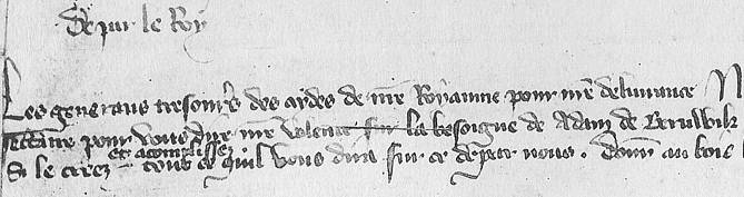


Distinctive letters : This is a Gothic cursive document hand of the French Secretary type (as opposed to the English Secretary which came later and did not resemble it particularly). It is modestly formal, emanating from the French chancery, but not too formal as, being a letter close, it is less grand and ostentatious than a charter, for example. It is in the French language.
The ascenders of b, d and l tend to be loopy, with marked differences in thickness between the upstrokes and the downstrokes. Descenders of g, q, y and z tend to be extravagant and curly. The letters long s and f are elongated and taper to points.
The most distinctive letters for distinguishing this from the contemporaneous English style of cursiva angicana are a, which is a simple single chambered letter; g, which has an open lower loop and a flattish extended top; r, which is a standard Caroline minuscule type sometimes formed in a rapid cursive manner, but not open or extending below the line as in English cursives; and the final short and curly s which consists of two completely closed loops.
The letters k and w only appear in the name Adam de Beruwik, which I would take to be an English name. The w is enlarged, as in English writing, but not so extravagantly curly and the k is simpler in form. No uppity English letters here!
The letter v is identical to u when it occurs in the middle of a word, but has a lopsided curly form, which may be confused with a b, when it occurs at the beginning. In some scripts of this time the same thing happens with u when it comes at the beginning.
The letters i and j are identical.
The letters g and q are easily confused, as their descenders are similar and curl the same way, but g has a flatter extended top.
It is difficult to tell from the photograph whether y is dotted; it might just be spots or streaks on the photograph or the original. I'll pop across to Paris and check one day.
As with many Gothic cursives, the minims tend to run together, so it can be tricky to untangle i, j, m, n, u, v and even r sometimes.
Run the cursor slowly along the lines of text to read some words. It won't make sense, as the document is chopped in half so the text is not continuous, but you might get the hang of the letters. To find out what it's all about, proceed to the paleography exercise.
Paleography
exercises using Flash ![]()
Requires at least the Flash 5 plugin
If you are looking at this page without frames, there is more information about medieval writing to be found by going to the home page (framed) or the site map (no frames).