Script Type : minuscule cursive
Date : late 15th century
Location : England
Function : personal hand
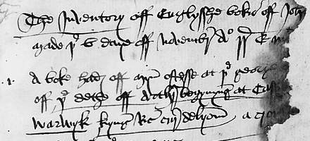


Distinctive letters: This is the ordinary personal cursive hand of a known individual, John Paston II. It comprises a list, in the English language, of English books in his personal possession, and was written between 1475, when one of the printed books listed was published, and 1479, when he died. It is therefore a closely identified piece of writing. The sheet is damaged on the right hand side, causing a small loss of text.
Being a cursive script of a relatively informal nature, the letter forms can be somewhat variable. The examples chosen here are the most typical. Ascenders of letter such as b, h, k and l tend to be closed loops. The letter h has a loopy descender and looks as if it is about to fall off the baseline, as is found in 16th century cursives. The letter g has a closed loopy descender, but is open at the top. The letter p is also open at the top. The letters p, q and y have simple. slightly curved descenders.
The letter a is the simple single chambered form. The letter e can be variable, at times rolling right over on to its back, another characteristic of 16th century cursives. (Well, they didn't all suddenly change the way they wrote when the bells tolled in the new year in 1500!)
There is no example of j as consonant in the sample, but i becomes extended down at the beginning of words or at the end of rows of is in Roman numerals. The letter y appears in many places where we would expect i.
The letters u and v are distinguished, v being tall and lopsided.
There are two forms of r, one being open and extending below the baseline showing its inheritance from cursiva anglicana, the other being the simplified form that appears mostly after o. This form sometimes resembles a z, as also found in 16th century cursives.
Long s is tall and tapered, while the final s is not short and loopy, but forms a simple upward flourish which sometimes looks a bit like s but at other times it may be hard to decide whether it is a letter at all.
The letter f has a loop in the ascender to distinguish it from s, and always appears doubled.
The letter w is a simple lopsided anglar form, but it is enlarged even when it appears in the middle of a word.
The thorn is used for th only in abbreviated words. At other times the letters are written out individually.
There is no example of z.
Pass the cursor slowly over the lines of text to get a bit of a handle on reading it. For more detail and some interesting observations on what a member of the rural gentry had in his library in the late 15th century, proceed to the paleography exercise.
Paleography
exercises using Flash ![]()
Requires at least the Flash 5 plugin
If you are looking at this page without frames, there is more information about medieval writing to be found by going to the home page (framed) or the site map (no frames).