Script Type : minuscule
Alternative Name : sometimes called Lombardic minuscule. This example is described as southern Italian semi-cursive, and also as scriptura latina minuscula antiquior, which of course just means little old Latin writing.
Date : Late 8th to 13th centuries. This is an example of the early type, from the 8th century.
Location : southern Italy
Function : Book hand.
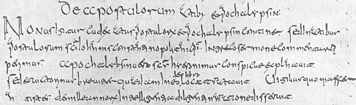


Distinctive letters : The first problem with this script is nomenclature. It is from southern Italy, of the type which evolved over time into the very recognisable Beneventan minuscule. This has some features of that later script, but has not developed the neat diagonal appearance with little flicked up feet that makes fully developed Beneventan look something like cross stitch embroidery. It is more upright, with taller wedgy ascenders, and perhaps has more in common, in general appearance, with some of the more horrid forms of Merovingian minuscule and their New Roman Cursive ancestors. Some paleographers have called it Lombardic minuscule, and insist that only scripts from southern Italy should be called Lombardic minuscule as the northern scripts are different and much more like Merovingian. As the Lombards were reputedly illiterate and lived largely in the north, this nomenclature does not make much sense. This, however, is the least of our problems as we try to read it.
The most distinctive and unusual letters are the a which is open at the top, the e which is tall and has a long curved central horizontal, the t which has a closed loop on its back. For once o gets to look a little different, with a teardrop shape which sometimes sports a little extension on the top. The letter y is short, and looks rather like an r with a dot over it.
The letter g is closed at the top, but has an open curling descender which curves to the left, while q has a fairly straight descender that just curves slightly to the right. It is always good to get those two sorted out.
The letter s is always long, extending above the small letters but not below the line. The letter x has a long and extravagant descender extending diagonally to the left.
The letters u and v are identical, as you might expect. There are no examples shown of j, w or z.
When the letters are separated out and nice clear examples are given, as above, many of them look friendly and familiar, but unfortunately that does not mean the script is easy to read. It utilises the most extraordinary array of ligatures which turn some letter combinations into something that looks like they have been produced by a spider on illicit substances. Some examples are given below.
 ac
ac  ae
ae  an
an  ct
ct  ep
ep  er
er  et
et  ex
ex  ri
ri  te
te  ti
ti Paleography
exercises using Flash (coming ... maybe) ![]()
Requires at least the Flash 5 plugin
If you are looking at this page without frames, there is more information about medieval writing to be found by going to the home page (framed) or the site map (no frames).