If you are looking at this page without frames, there is more information about medieval writing to be found by going to the home page (framed) or the site map (no frames).
| Modes of Reading in the Middle Ages (2) | |||||
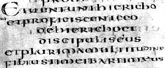
| The system of word layout known as per cola et commata, which involved setting out lines so that they made more sense for reading aloud, was evidently known from the days of St Jerome himself, and was commented on by Cassiodorus as a means of making the gospel texts comprehensible to the less scholarly of the brothers. (Petrucci 1995) | |
||||
| 6th century Italian gospel (British Library, Harley 1775, f.195), by permission of the British Library. | |||||
|
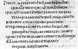
Segment of a leaf from the late 7th century Ceolfrith Bible (British Library, add. ms. 45025), by permission of the British Library. | ||||
| The example at left is from a set of isolated leaves that were preserved because they had been used as wrappers for estate documents; another fragmentary discard. | |||||
| In the examples above, the words still run together for the most part, but the lines are not packed. The first example is a single column page, the second shows one of two columns. The process of reading is not fundamentally different to that of reading continuous text, but it has been made a little easier. The process of learning the text is presumably simplified at the same time. Sometimes when word separation was introduced, it occurred in an erratic and incorrect manner, probably because of a lack of true reading literacy among the copyist scribes. When this happens, reading comprehensibility is actually hindered. | |||||
| In some of the more distant quarters of western Christendom, Latin was unfamilar as a spoken language. For the monastic communities in these areas, the brethren were not only learning to read, but learning a second language. Latin was learned from books, and by study of the works of the Classical grammarians whose works they assiduously copied. In a much quoted article, Malcolm Parkes (Parkes 1991) has credited insular scribes from Ireland and England with the introduction of certain qualities of writing which increased its legibility; word spacing, punctuation and abbreviation. | |||||
|
|||||
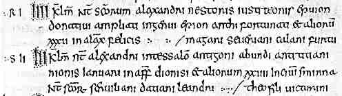
| Segment from a page of an 8th century martyrology written in insular minuscule script (Paris. Bibliothèque Nationale, MS Lat. 10837, f.8). (From New Palaeographical Society 1910) | |||||
| The above example shows all those characteristics. Petrucci (Petrucci 1995) has pointed out that word separation also appeared at about the same time in some German centres, in some Swiss Rhenish manuscripts and in some works from northern Italy. However, in all cases the same principle applies. Literacy and the Latin language were being learned together. | |||||
| It is easy to see how word spacing and punctuation could make text easier to read, but the inclusion of abbreviation indicates a major change in the nature of reading. The fundamental unit is no longer the letter, but a graphic sign representing a word. Is this all starting to sound like a modern educational debate on reading methods? It is easy to conceptualise the nomina sacra term xpi for Christi as a graphic representation, but perhaps harder to see some of the standard Latin contractions in that way. Think about it though. It became rapidly common to use a superscript slash instead of m or n, two of the most visually confusing letters when embedded in a word, especially when in proximity to i, u or v. Standard Latin endings such as -us or -orum were abbreviated, allowing the reader to get a grab on the important part of a word at a glance. | |||||
| The script of highly formal works, such as Bibles and gospels, was uncial; a script with clear and recognisable letter forms, even if their organisation was sometimes confusing. The varieties of insular minuscule, used in England, Ireland and some continental monasteries founded from those places, also have clearly formed letters. Some might disagree on this, but really the problems with reading insular minusule are to do with the unfamiliarity of some letter forms. The internal code is very consistent. However, the miscellany of scripts used in pre-Caroligian Europe, sometimes known inaccurately as the National Hands, are variable in letter form and confusing to read. Given that surviving example sets from early monastic collections show a great deal of internal variability, it seems that even the concept of house styles was rather fluid, and clarity for general reading was not the primary function of writing. | |||||
|
Fancy initials and heading scripts were used as place markers for significant places in the text. Such graphic symbols can also serve as memory aids for learning the text. The mental association between visual imagery, layout and text was specifically prescribed as a system for memorisation in the medieval period. In the pre-Carolingian period, initial letters were varied and fanciful, often containing animal, fish or bird imagery and elaborate interlace. Certain stylistic traits may be associated with geographic areas or specific scriptoria, but they do not provide a universally legible system of reading aids. | ||||
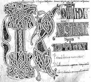
| Initials from the Book of Kells (Trintiy College, Dublin,f.104r). (From Sir Edward Sullivan 1952 The Book of Kells London and New York: The Studio Publications). | |||||
|
Heading from an 8th century Gallican lectionary (Paris, Biblithèque nationale, fonds latin 9427, f.143). (From Steffens 1929) | ||||
| The above example, from a lectionary written in Luxueil minuscule, shows two different angular and fanciful heading scripts above and below a line of uncial. The truncated T initial in the bottom line displays the fish motif common in Merovingian manuscripts. | |||||
|
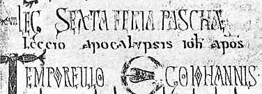
Inital and heading from an 11th century Mozarabic antiphoner (British Library, add. ms. 30820, f.102v), by permission of the British Library. | ||||
| Visigothic manuscripts, such as this antiphoner, seem to have had particularly wild and wacky initials and headings, which persisted, along with the script itself, for many centuries. | |||||
| The Carolingian revolution in book production did more than just introduce a new. clear and legible script, Caroline minuscule, but regularised other aspects of book design to aid legibility and increase the accuracy of texts. | |||||
|
|
|||||
|
If you are looking at this page without frames, there is more information about medieval writing to be found by going to the home page (framed) or the site map (no frames). |
|||||